Can a room change the way you breathe, or even the way you think? As designers and curators of the spaces we inhabit, we have long moved past the era where interiors were defined solely by their utility. Today, we are witnessing a profound shift toward "sensorial interiors"—spaces designed not just for the eye, but for the soul. At the heart of this movement is 3form’s 2025 Color Collection, a masterfully curated palette that challenges us to view material selection through the lens of emotional resonance.
The 3form 2025 Color Collection is more than a simple update to a catalog; it is a sophisticated system of 10 colors organized into five emotional pairings. By introducing four brand-new vivid hues to their expansive 250-color portfolio, 3form has focused on tertiary tones to achieve a balanced emotional spectrum. The collection utilizes a structured 1:1 ratio, pairing a saturated primary hue with a muted, softer counterpart. This strategic design ensures that whether you are seeking to inspire productivity in a bustling office or cultivate serenity in a healthcare sanctuary, the materials provide a built-in harmonic cadence.
The Science of the 1:1 Ratio: Five Emotional Pairings
The genius of the 2025 palette lies in its duality. 3form’s design team understood that for every "high-energy" moment, a space needs a moment of "restorative silence." By pairing bold colors with their tempered siblings, they have simplified the decision-making process for designers while ensuring psychological depth.
1. Restoration & Nature: Jewel and Buoyant
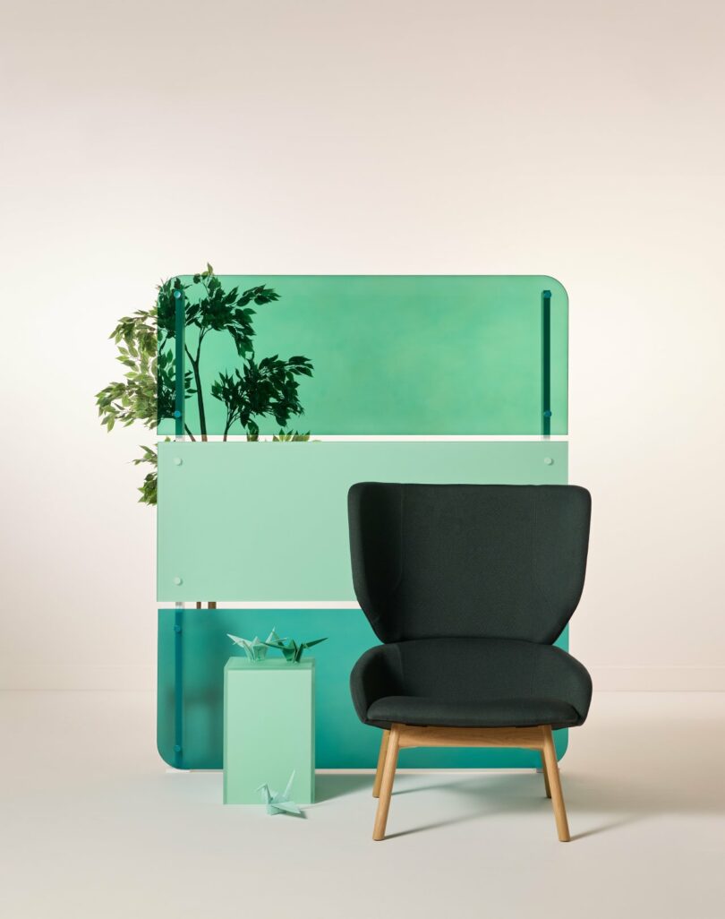
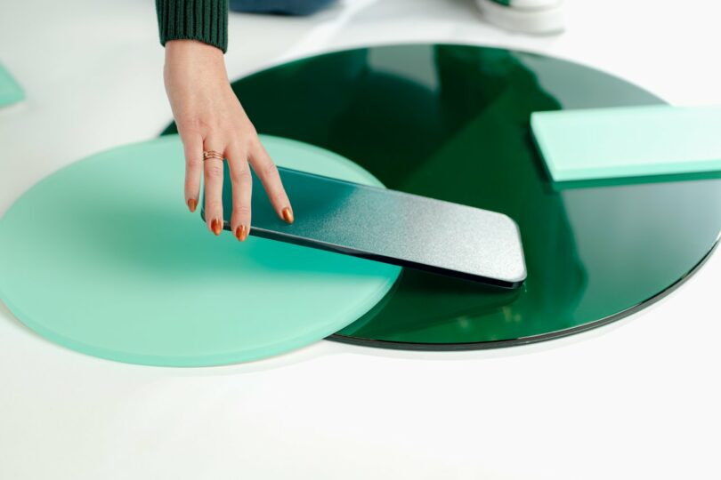
In an increasingly digital world, the craving for biophilic connection is at an all-time high. The pairing of Jewel, a deep, saturated teal, and Buoyant, a serene, airy green, creates an immediate sense of natural balance. This duo mimics the transition from the deep depths of a forest pool to the sunlight hitting the leaves above.
- Psychological Impact: Promotes harmony, lowers cortisol, and fosters a sense of renewed equilibrium.
- Best For: Meditation rooms, spa-inspired bathrooms, and "recharge" zones in corporate environments.
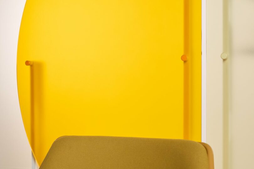
2. Vibrant Energy: Pharaoh and Lemon
To stimulate the mind and invite optimism, 3form introduces the radiant gold of Pharaoh alongside the luminous soft yellow of Lemon. Unlike the harsh yellows of the past, these tones feel architectural and deliberate. They capture the essence of morning light, infusing a space with a "glow-from-within" quality that is particularly effective when used with translucent materials.
- Psychological Impact: Encourages joy, social interaction, and mental clarity.
- Best For: Collaborative coworking spaces, school libraries, and modern cafe environments.
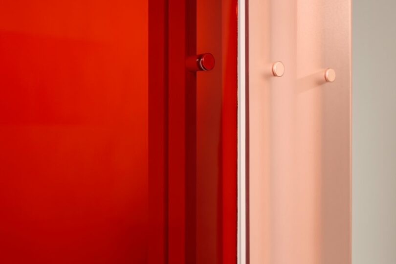
3. Creativity & Confidence: Vermillion and Sunstone
For spaces that demand a bold statement, the combination of Vermillion and Sunstone offers a sophisticated take on the warm spectrum. Vermillion provides a courageous, red-orange punch, while Sunstone acts as its tempered, earthy foundation. This pairing is about the spark of an idea and the discipline required to see it through.
- Psychological Impact: Invigorates the senses, builds creative confidence, and demands attention without being overwhelming.
- Best For: Feature walls in design studios, boutique retail displays, and dynamic entryways.
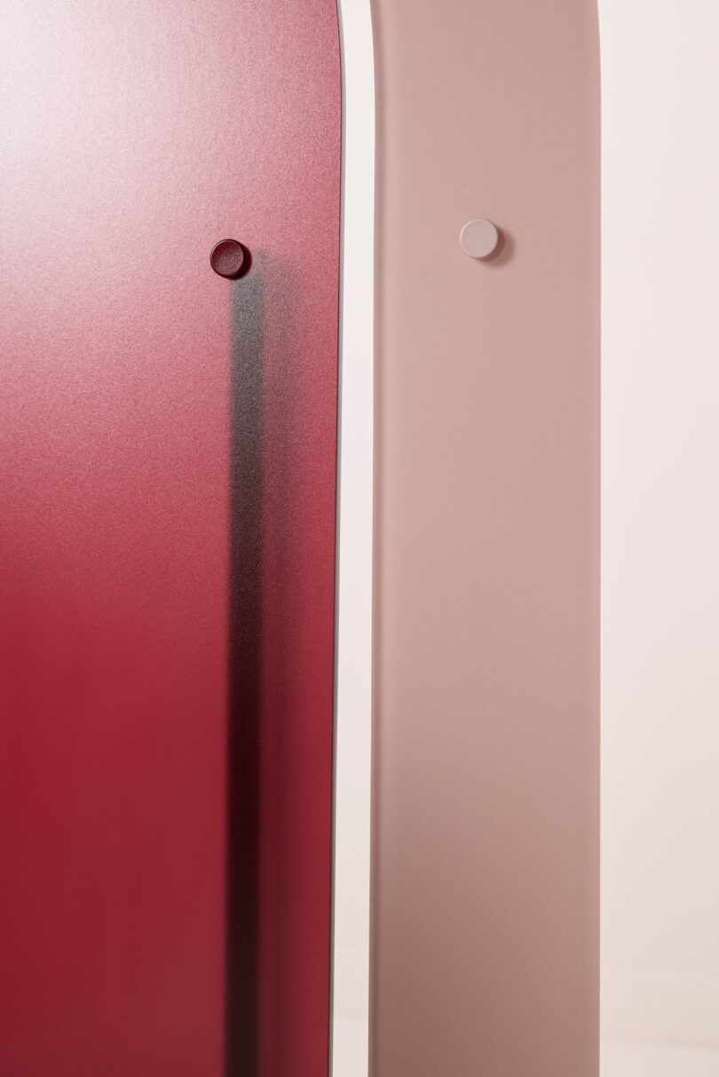
4. Quiet Luxury & Sophistication: Winterberry and Teaberry
Moving away from the cold grays of the last decade, 3form embraces the richness of "ripened fruit" tones. Winterberry, a deep, regal purple-red, pairs beautifully with Teaberry, a sophisticated, muted mauve. This is the embodiment of "quiet luxury"—it feels expensive, grounded, and timeless.
- Psychological Impact: Conveys elegance, stability, and a sense of history and permanence.
- Best For: Executive boardrooms, luxury hotel suites, and high-end dining booths.
5. Grounded Balance: Tourmaline and Ivory
Not every space needs to shout; some need to provide a soft landing. Tourmaline, a velvety neutral with hints of moss, pairs with Ivory to create a palette of reassured confidence. It’s the ultimate expression of "neutral with a soul," providing a backdrop that supports rather than distracts.
- Psychological Impact: Stability, focus, and a feeling of being well-supported.
- Best For: Minimalist residential lofts, patient check-in desks, and focused study carrels.
Materiality: The Vessels of Emotion
Color is only as effective as the material that carries it. In the 2025 collection, 3form has curated specific material-finish combinations to maximize the emotional impact of each hue. The collection is primarily featured in three high-performance materials:
| Material | Signature Finish | Best Application | Key Benefit |
|---|---|---|---|
| Varia Resin | Sandstone | Floor-to-ceiling walls | High durability with a soft, matte diffusion of light. |
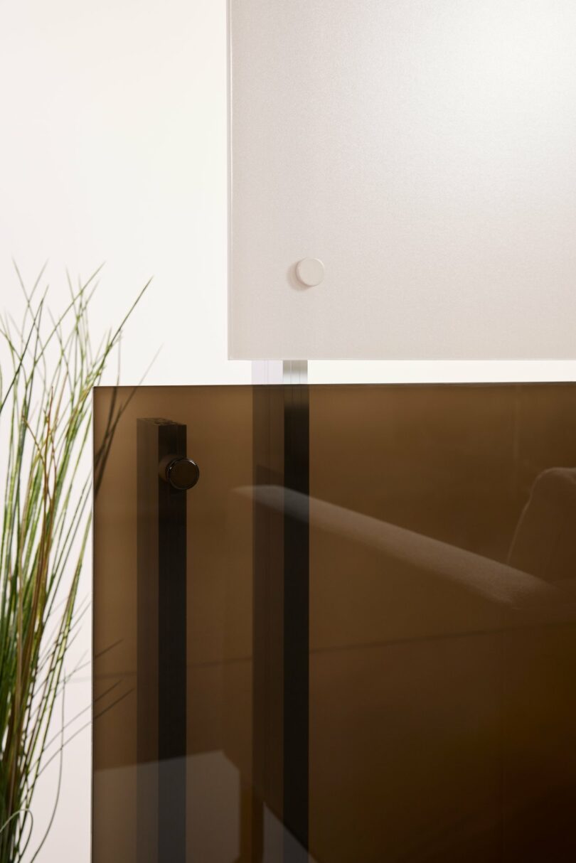
| Laminated Glass | Low-Iron / Clear-Float | Room dividers & acoustics | Sophisticated clarity and structural weight for permanent installations. |
| Chroma | Vellum | Backlit features & furniture | Matte surface that prevents glare while allowing a brilliant internal glow. |
Varia Resin Panels: The Architect's Canvas
Varia panels with Sandstone finishes are perhaps the most versatile medium for this collection. The subtle texture of the Sandstone finish softens the boldest colors, like Vermillion or Pharaoh, making them feel more integrated into the architecture rather than just a surface treatment. Because Varia is made from high-performance resin, it can be curved or shaped, allowing the emotional palette to wrap around the user in three dimensions.
Chroma and the Power of Light
When a designer wants to create a focal point—a "beacon" of emotion—Chroma is the go-to material. Utilizing the Vellum finish, Chroma panels become ethereal when backlit. Imagine a reception desk glowing in the soft, optimistic yellow of Lemon or a tabletop in the calming Teaberry. The Vellum finish is specifically engineered to hide the light source (the "hot spots") while providing a uniform, velvety glow that transforms a functional piece of furniture into a piece of art.
Strategic Applications: Designing for Human Well-being
The 2025 Color Collection isn't just a trend; it's a strategic tool for various industries. By selecting colors based on psychological categories, we can design spaces that serve the specific needs of their occupants.
- Healthcare: In environments where stress levels are naturally high, the use of restorative greens like Buoyant can have a measurable impact. Studies in the psychology of color in architecture suggest that these "nature-adjacent" tones can help lower patient anxiety and improve the overall healing atmosphere.
- Hospitality: For luxury hotels, the goal is often "reconnection." Using the Winterberry and Teaberry pairing in guest suites creates a sanctuary of quiet luxury, allowing travelers to feel grounded and pampered the moment they step through the door.
- Workspaces: The modern office is no longer just a place for desks; it is a hub for creativity and energy. Incorporating Pharaoh or Vermillion in communal brainstorming areas can boost productivity and foster a spirit of collaborative optimism.
Final Thoughts from the Editor
As we look toward 2025, the most successful interiors will be those that prioritize how a person feels within them. 3form has given us a sophisticated toolkit to achieve exactly that. By balancing the bold with the muted, and the luminous with the matte, we are no longer just choosing colors—we are choreographing emotions.
Editor's Tip: When working with the 2025 palette, don't be afraid to mix materials. Use Varia for privacy partitions to capture the daylight, and pair it with a backlit Chroma reception desk in the same color family to create a layered, immersive experience.
FAQ
What are the five emotional categories in 3form’s 2025 palette? The collection is categorized into: Nature-inspired Restoration (Jewel/Buoyant), Vibrant Energy (Pharaoh/Lemon), Creativity & Confidence (Vermillion/Sunstone), Quiet Luxury (Winterberry/Teaberry), and Grounded Balance (Tourmaline/Ivory).
Can the 2025 Color Collection be used outdoors? While 3form Varia and Chroma are primarily designed for interior applications, their Laminated Glass options with the 2025 palette are excellent for exterior-facing windows or protected outdoor dividers, offering superior UV stability and weather resistance.
What makes the "Sandstone" finish different from "Vellum"? Sandstone (typically used on Varia) provides a subtle, grainy texture that diffuses light while maintaining a high degree of privacy. Vellum (typically used on Chroma) is a smoother, more matte finish designed specifically to optimize light diffusion for backlit applications, eliminating harsh glare and hotspots.