Quick Facts
- Worst Overall: Stark White, as it induces severe sunlight glare and fails to hide everyday dirt visibility.
- Worst for Floors: Solid Black and deep charcoal due to low Light Reflectance Value leading to excessive heat absorption.
- Economic Downside: Homes with bright yellow exteriors typically sell for between $3,000 and $4,000 less than comparable properties.
- Maintenance Warning: Dark saturated tones on horizontal surfaces are prone to thermal peeling and require professional repainting costs of $820-$1,340.
- 2026 Favorite: Warm neutral porch paint colors like Universal Khaki and earthy tones are replacing clinical grays.
- Design Pro-Tip: Utilize Sherwin Williams porch paint colors in muted shades for ceilings to achieve the classic Haint Blue look while aiding light reflection.
- Key Metric: Always check the Light Reflectance Value before purchasing to ensure outdoor longevity and comfort.
In 2026, designers recommend avoiding stark white, saturated bright red, and solid black for porch exteriors. These porch paint colors suffer from high UV fading, excessive heat absorption on horizontal surfaces, and harsh sunlight glare, often leading to rapid peeling and poor curb appeal.
As we look toward the design trends of 2026, the porch has evolved from a simple transition zone into a true outdoor living room. In my years as an editor, I have seen homeowners make the mistake of treating the porch exactly like an interior room, only to realize that the sun, rain, and fluctuating temperatures are far less forgiving than a climate-controlled hallway. Choosing the wrong colors does not just hurt your aesthetic; it can lead to physical damage to your home’s exterior and a significant hit to your resale value.
1. The Thermal Trap: Solid Black & Deep Charcoal
It is tempting to choose a high-contrast, modern look by opting for deep charcoals or solid black for your porch. While this looks stunning in a high-gloss magazine spread, the reality of living with it is quite different. In 2026, design professionals are steering clients away from these ultra-dark shades on horizontal surfaces like floors and steps. The primary culprit is heat absorption.
Dark colors have a very low Light Reflectance Value, or LRV. For example, a shade like Silhouette AF-655 may look sophisticated, but it absorbs a massive amount of solar energy. This leads to what we call thermal peeling. The heat causes the wood or concrete to expand and contract at a rate the paint cannot keep up with, leading to premature cracking. Furthermore, a black porch floor can become hot enough to burn bare feet or pet paws during a summer afternoon.
Instead of solid black, look for mid-tone concrete porch paint colors that offer depth without the thermal consequences. Grays like Iron Mountain or Pewter Cast are far more practical options for cement porch paint colors. These shades provide that moody, grounded feel but reflect enough light to remain structurally sound and comfortable to walk on.
2. High-Maintenance Blunders: Stark Glossy White
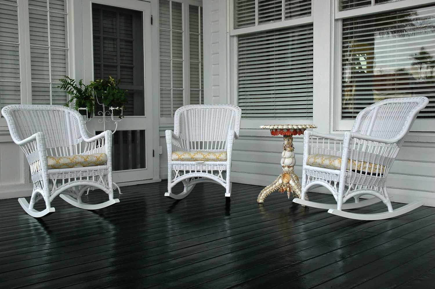
There is a fine line between a crisp, clean aesthetic and a clinical one that requires a pressure washer every three days. Stark, glossy white is officially landing on the list of worst porch paint colors to avoid in 2026. While white is a classic choice for trim, using it on large spans of porch walls or floors creates two major problems: sunlight glare and high maintenance.
In direct sunlight, a stark white porch can become blinding, making it impossible to enjoy the space without sunglasses. From a practical standpoint, the dirt visibility is off the charts. Every footprint, pollen smudge, and leaf stain is magnified against a bright white backdrop. As a design editor, I always recommend moving toward warm neutral porch paint colors. These off-whites and soft creams maintain the bright feeling you want but have enough undertone to mask the inevitable wear and tear of outdoor living. Moving toward a palette that feels nature-grounded will ensure your curb appeal remains intact without a weekly scrubbing schedule.
3. The 2026 Trend Shift: Outdated Cool Grays
For the last decade, cool, blue-based grays reigned supreme in exterior porch paint colors. However, the 2026 design landscape is pivoting sharply toward warmth. Cool grays now feel dated and often clash with the natural landscape or the warm tones found in modern stone and brickwork.
The industry is seeing a major replacement of these chilly tones with greige and earthy tones. The best porch paint colors for the coming years are those that feel organic. Universal Khaki is a standout example of this shift. It provides a sophisticated backdrop that bridges the gap between traditional and modern styles. When you choose a warm neutral, you create a seamless transition between the green of your lawn and the interior of your home. If your home has existing stone or brick, a cool gray paint will usually make those natural materials look muddy or yellowed by comparison.
| Feature | Old Trend (Avoid) | 2026 Trend (Adopt) | Benefit |
|---|---|---|---|
| Porch Floor | Jet Black (LRV < 5) | Pewter Cast (LRV 20-30) | Reduced heat & peeling |
| Main Walls | Stark Brilliant White | Warm Alabaster / Greige | Less glare & hides dirt |
| Ceiling | Navy or Dark Gray | Muted Haint Blue | Airy feel & insect deterrent |
| Trim | Cool Steel Gray | Universal Khaki / Olive | Blends with landscape |
4. Exterior Clashes: Saturated Primary Reds & Electric Blues
While we all love a pop of color, 2026 is the year of the "muted" palette. Saturated primary reds and electric blues are being flagged by designers for their poor performance under UV rays. These bright pigments are notoriously prone to UV fading, meaning your vibrant red porch could look a tired, chalky pink within just two seasons.
Beyond the maintenance, there is a clear economic impact to these choices. A 2026 survey of design professionals found that 37% of experts identify harsh red paint over brick exteriors as one of the least desirable outdoor design choices. Furthermore, high-visibility colors like bright yellow can significantly impact your bottom line; data indicates these homes sell for less than their more neutrally-painted counterparts.
If you crave color, look at the Sherwin williams porch paint colors that favor a "distressed" or "muted" look. Think terracotta instead of fire-engine red, or a dusty slate instead of electric blue. These colors offer personality without overwhelming the architectural styles of your home or scaring off potential buyers.
Design Insight: According to research from Zillow, homes with front doors painted pale pink sell for an average of $6,516 less than expected home value. It is always better to save the bold expression for removable decor like pillows and planters.
5. Flooring Failures: Natural Wood Errors
One of the biggest mistakes I see in room makeovers involves wood porch paint colors. Homeowners often choose a beautiful light color but forget the science of the wood itself. If you are painting a wood porch, especially one made of cedar or redwood, you must account for tannin bleeding. Without a high-quality stain-blocking primer, the oils in the wood will seep through your paint, creating brownish-yellow splotches that no amount of topcoat can hide.
For 2026, the trend for wood floors is moving away from solid paints that hide the grain entirely. Instead, designers are opting for semi-solid stains in mid-tone browns and weathered grays. If you must paint, ensure it is a high-quality latex enamel designed specifically for floors. The goal is outdoor longevity, which requires products that can breathe while providing a durable barrier against moisture.
6. Ceiling Sophistication: Avoiding Heavy Tones
The porch ceiling is often referred to as the "fifth wall," but many people treat it as an afterthought or paint it a dark, heavy color to match the shutters. In 2026, designers are warning against dark ceilings for porches, especially for paint colors for screened in porch areas. A dark ceiling can make the space feel cramped and claustrophobic, essentially "lowering" the roofline visually.
The classic Haint Blue tradition is still the gold standard for a reason. Using blue porch ceiling paint colors like Sherwin-Williams Aviary Blue or Benjamin Moore Palladian Blue serves multiple purposes. Historically, it was believed to ward off evil spirits (haints), but practically, it mimics the sky, making the porch feel open and airy even on a cloudy day. There is also a long-held belief that these soft blue tones deter insects from nesting, as they mistake the ceiling for the open sky. For a sophisticated look, keep your ceiling light and let it reflect the soft evening glow.
FAQ
What color is replacing gray in 2026?
The design world is moving away from cool, sterile grays in favor of warm neutrals and earthy tones. Specifically, greige—a mix of gray and beige—along with soft olives and warm khakis are becoming the new neutrals for exterior spaces. These colors offer a more welcoming feel and blend better with natural outdoor environments.
What paint colors should I avoid for a front porch?
You should generally avoid stark white due to glare and maintenance, solid black because of heat absorption, and highly saturated primary colors like bright red or electric blue which tend to fade quickly. Additionally, avoid very light colors on high-traffic floor areas as they will show every scuff and speck of dirt.
What is the best color to paint a porch?
The best choice depends on the surface, but for walls, warm neutrals and soft earthy greens are highly recommended. For ceilings, a soft sky blue or Haint Blue remains a timeless and functional choice. For floors, mid-tone grays or taupes are ideal as they effectively hide dirt while resisting excessive heat.
How to make a front porch look expensive?
To create a high-end look, stick to a cohesive color palette that complements your home’s architectural style. Use a satin or semi-gloss finish for trim to create contrast against matte walls. Adding a classic light blue to the ceiling and choosing mid-tone, sophisticated colors for the floor can elevate the space significantly.
What is a good color to paint a porch?
If you want a safe yet stylish choice, go with a warm taupe or a muted sage green. These colors are versatile, have excellent curb appeal, and are practical for maintaining a clean appearance over time. For the floor, a slate gray or a deep tan provides a solid foundation that hides wear while looking polished.