In the world of Manhattan real estate, 680 square feet is often regarded as a "starting point"—a modest footprint where one expects to make significant compromises. Usually, those compromises involve choosing between a full-sized dining table or a home office, or deciding whether a bicycle belongs in the hallway or the shower. But when a design-savvy couple approached this West Village warehouse conversion, they didn't want to choose. Their brief was ambitious: they needed a workspace, storage for their outdoor gear (including bikes), and a dining area that could comfortably seat six people for a Saturday night dinner party.
As an editor who has toured hundreds of NYC apartments, I’ve seen many "small space solutions" that feel like temporary patches—folding chairs, plastic bins, and cramped corners. This renovation, however, is a masterclass in architectural precision. It proves that when success is measured down to a quarter-inch, a small footprint can feel like a sprawling loft. The secret lies not in adding more things, but in rethinking the very bones of the apartment.
1. Lifting the Lid: Revealing Vertical Volume
When dealing with a small footprint, the most valuable real estate is often hiding right above your head. In many older West Village buildings, decades of renovations have added drop ceilings to hide plumbing or electrical runs, effectively "squashing" the living experience.
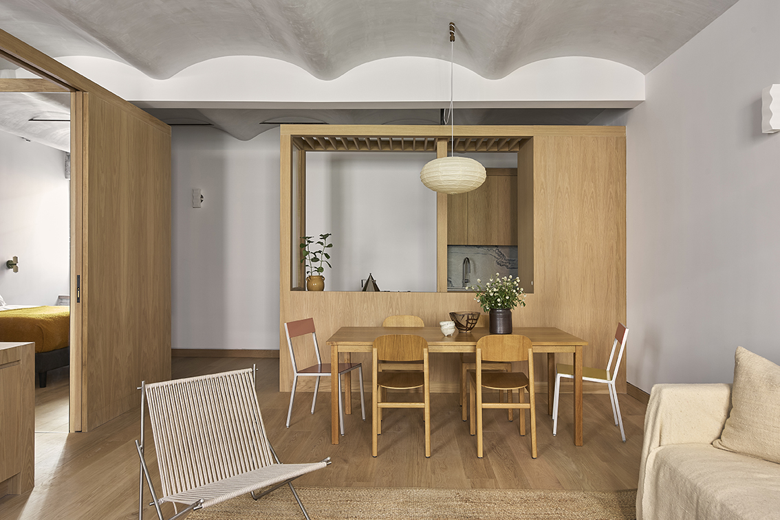
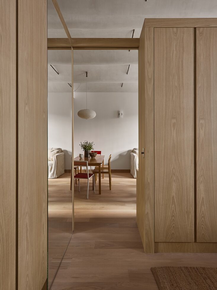
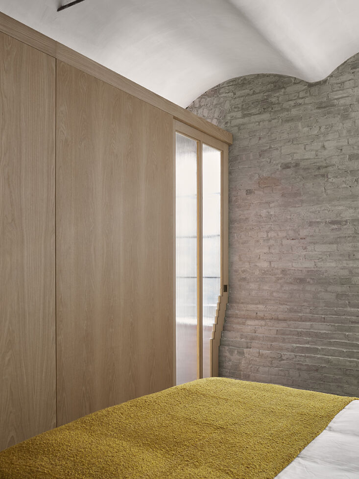
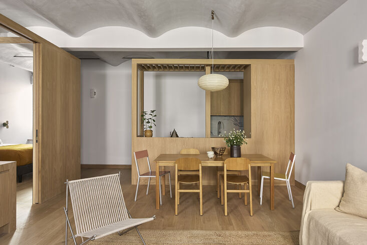
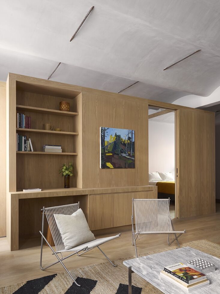
The first move in this renovation was an act of architectural archaeology. By stripping away the layers of drywall and acoustic tile, the designers revealed the building's original barrel-vaulted masonry ceilings. This single move didn't just add a few feet of height; it changed the entire atmospheric quality of the home. Revealing hidden vaulted ceilings is a key design strategy in warehouse conversions; it adds significant vertical volume and historical character to a small footprint, making the 680 square feet feel immediately more expansive.
The original structural steel ties were left exposed, their dark patina providing a rhythmic contrast to the newly brightened space. This verticality allows the eye to travel upward, distracting from the limited horizontal floor area. It’s a reminder that volume is just as important as square footage.
2. Breaking the Box: Eliminating Full-Height Partitions
The traditional way to divide a one-bedroom apartment is with floor-to-ceiling walls. However, in a 680-square-foot space, these walls act like blinkers on a horse, restricting your view and trapping light in small, dark pockets.
To make a 680-square-foot apartment feel more spacious, architects recommend eliminating full-height partitions to preserve ceiling continuity and allow natural light to reach the entire floor plan. By keeping the "walls" below the ceiling line—or replacing them with multifunctional furniture volumes—the vaulted ceiling remains unbroken from the front door to the back window.
The impact of this strategy is measurable. By removing internal walls, this West Village renovation increased the reach of natural light from north-facing windows to cover 100% of the apartment's living areas. Instead of a dark kitchen and a bright bedroom, the entire home now glows with a consistent, soft light that makes the boundaries of the rooms feel fluid rather than fixed.
3. The Power of Integrated Millwork
If walls are the enemy of the small apartment, integrated millwork is its greatest ally. Rather than buying separate wardrobes, desks, and cabinets—which create visual "noise" and wasted gaps—this home utilizes three freestanding white oak volumes.
These volumes act as the Swiss Army Knife of interior design. Integrated millwork volumes are the most efficient storage solution for small NYC homes, as they can consolidate closets, workspace, and bicycle storage into multifunctional furniture units. By grouping these functions together, the floor plan remains open and "uncluttered" by the typical debris of daily life.
Pro Tip: When designing millwork for a small space, use a single material—like the white oak seen here—to create a sense of cohesion. This "monomaterial" approach prevents the eye from getting snagged on too many different textures, making the room feel larger.
The efficiency of this approach is staggering. The use of three freestanding millwork volumes provided 35% more storage capacity than standard built-in cabinets while maintaining an open-concept flow. One volume hides the refrigerator and pantry, another houses a streamlined home office, and the third neatly tucks away two bicycles, keeping them off the floor and out of the way.
4. Furniture Strategy: Fewer, Bigger, Better
A common mistake in small-space decorating is buying "apartment-sized" furniture—tiny sofas and spindly chairs. Paradoxically, a room full of small furniture often feels more cluttered and "bitty" than a room with a few well-chosen, full-sized pieces.
In this West Village home, the furniture strategy was "fewer, bigger, better." Instead of a loveseat and two accent chairs, the living room features a deep, generous sectional. This creates a clear zone for relaxation and provides more seating than a collection of smaller items would.
The Selection Criteria:
- The Pedestal Table: By choosing a dining table with a central pedestal rather than four legs, the floor feels more open, and it's easier to squeeze in that sixth guest.
- Natural Palette: The use of white oak, light stone, and neutral textiles ensures that the larger furniture pieces don't feel heavy or overbearing.
- Visual Transparency: Low-profile furniture keeps sightlines open across the apartment, emphasizing the 100% light reach mentioned earlier.
5. Zoning for Remote Work and Privacy
Living and working in 680 square feet requires a high degree of intentionality. You can't just "find a spot" for a desk; it has to be integrated into the architecture of the home. In this renovation, the workspace is tucked into one of the white oak volumes, allowing the user to "close the door" on work at the end of the day—a psychological necessity in a small home.
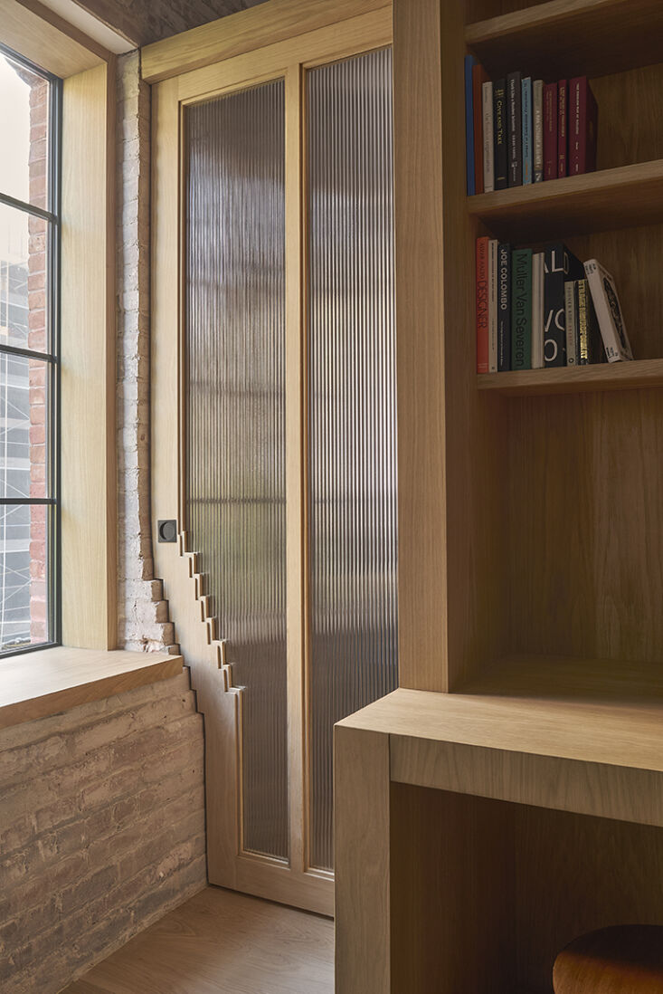
Privacy, especially in the bedroom, is handled through bespoke architectural details. Rather than a standard swinging door that wastes floor space, the designers created an interlocking door frame. This detail echoes the staggered profile of the building’s original masonry brickwork, allowing the door to sit perfectly flush when closed.
| Feature | Standard NYC Small Apartment | The West Village Makeover |
|---|---|---|
| Ceiling Height | Often 8-9ft with drop ceilings | Exposed vaults (10ft+) |
| Light Reach | ~40% (trapped by walls) | 100% (open plan) |
| Storage Style | Mismatched wardrobes/closets | Integrated millwork volumes |
| Storage Gain | Baseline | +35% Efficiency |
| Workspace | Makeshift / Dining Table | Dedicated integrated desk |
The result of these surgical interventions is a home that doesn't just "manage" its small size but celebrates it. Every quarter inch has been considered, and every material choice serves to enhance the sense of space and light.
FAQ
Q: Is it expensive to reveal vaulted ceilings? A: It can be. The cost depends on what is hidden behind the drop ceiling (pipes, wires, etc.) and the condition of the masonry. However, the value it adds to the apartment's aesthetic and perceived size is often the best ROI in a renovation.
Q: How do you handle acoustics in an open-plan apartment with no full-height walls? A: Soft goods are your best friend. In this project, the use of a deep sectional, area rugs, and window treatments helps absorb sound. Additionally, because the "volumes" don't reach the ceiling, the air and sound can circulate, which actually prevents that "boxy" echo found in small, walled-off rooms.
Q: Where do the bicycles actually go? A: One of the three white oak millwork volumes is specifically deep enough to house two bikes vertically. They are hidden behind a sleek wood panel, making them completely invisible when not in use.
Ready to rethink your own small space? Whether you're in a West Village warehouse or a modern studio, the principles remain the same: look up, clear the walls, and invest in millwork that works as hard as you do.