Does anyone else feel like the modern world is getting a bit too loud? In our quest for "clean" and "minimalist" spaces over the last decade, we inadvertently created homes that often feel more like sterile galleries than sanctuaries. But as we look toward 2026, the pendulum is swinging back—and it’s swinging toward color. Not just a splash of color on an accent wall, but a full-immersion experience.
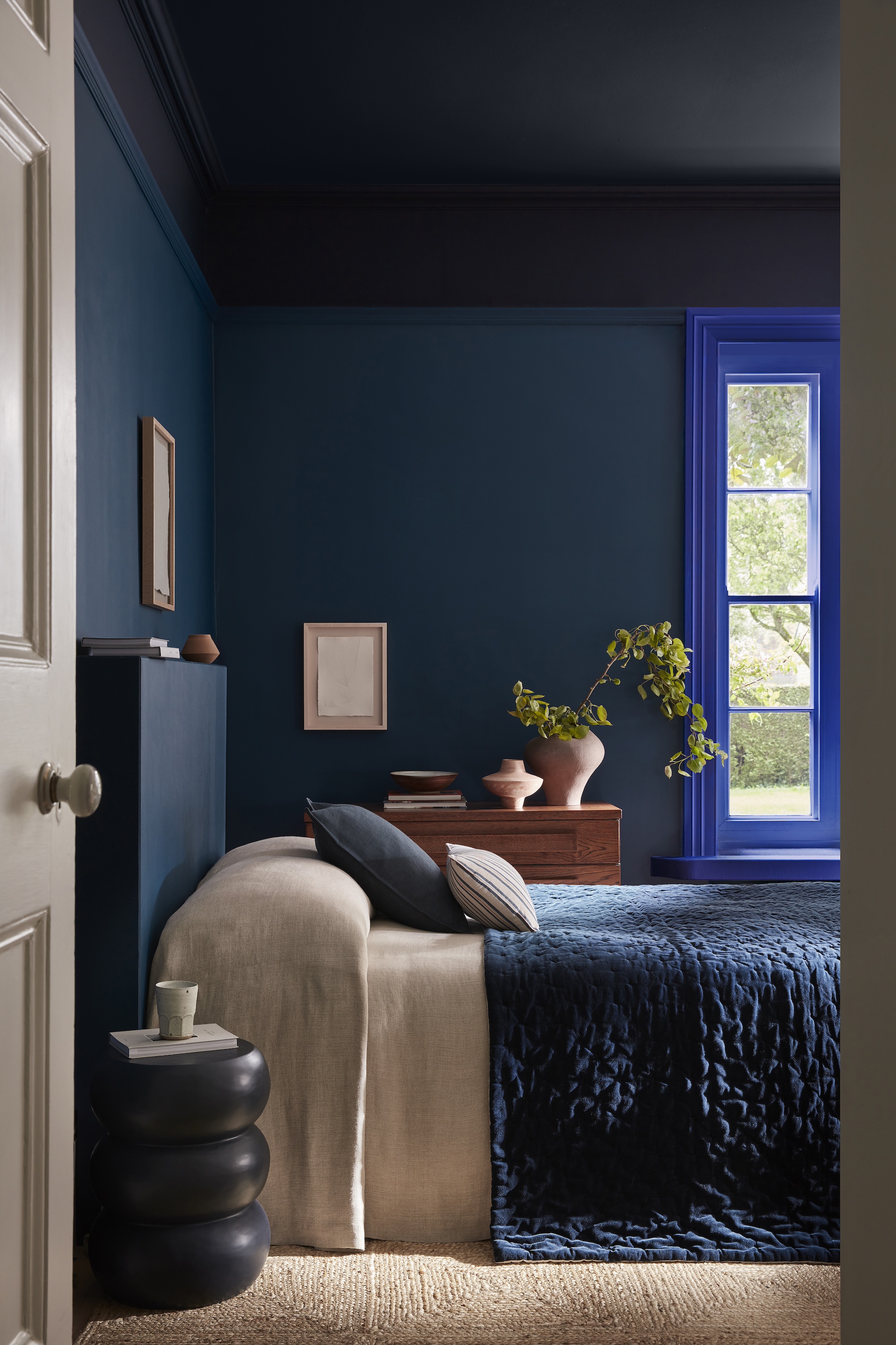
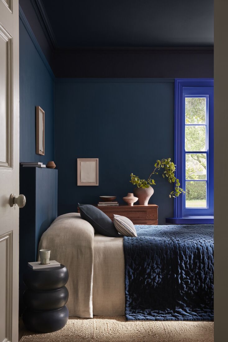
Enter the "Double Drenching" trend. Designers are reporting a 40% increase in the adoption of this technique for primary bedrooms as we head into the new year, moving away from traditional white-trim schemes in favor of something much more evocative. By layering multiple shades of blue across walls, ceilings, and woodwork, you create what I like to call a "hibernation cave"—a space that feels 25% more relaxing than high-contrast rooms. It’s about more than just aesthetics; it’s about the psychological shift that happens when you step into a room that breathes with you.
What is Double Drenching? The Bold New Way to Paint
For years, the "safe" way to paint a room was to choose a color for the walls and a crisp white for the skirting boards, window frames, and doors. "Double drenching" throws that rulebook out the window. This technique involves applying two or more different shades from the same color family—such as a deep navy and a vibrant mid-tone—to different architectural elements of the room.
The goal is to eliminate the harsh "outline" effect that white trim creates. When your trim matches or closely relates to your wall color, the boundaries of the room soften. The eye doesn't get "stuck" on the edges, allowing the space to feel infinitely more expansive yet incredibly cozy.
Ivy’s Pro Tip: To master this look, play with finishes as much as hues. Use a flat matte on the walls to absorb light and create a velvety, soft-focus effect. Then, use a soft sheen or eggshell on the trim and doors. This subtle shift in light reflection adds architectural depth without breaking the monochromatic spell.
The Top 2026 Blue Palettes for Every Style
Choosing the right blue is a deeply personal endeavor. For 2026, we are seeing a move toward "Saturated Sophistication"—colors that have a bit of "dust" or "smoke" in them to keep them from feeling primary or childlike.
1. The Dramatic Midnight
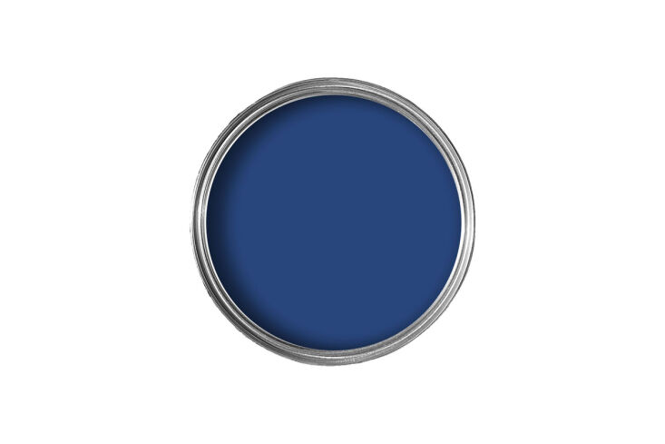
For those who want a bedroom that feels like a high-end hotel suite, deep indigo and midnight blues are the way to go. We’re seeing a rise in pairing "Royal Navy" with "Smalt" from brands like Little Greene. This combination is regal, grounding, and looks spectacular under warm evening light.
2. The Spa-Like "Misty Blue-Green"
If "dark and moody" isn't your speed, look toward the ethereal side of the spectrum. Misty blue-greens (think of the ocean on a foggy morning) provide a serene, spa-like atmosphere. Pairing a pale "Summer Shower" wall with a slightly deeper "Iceberg" trim creates a room that feels filled with air and light.
3. The Modern Grounded Blue
A major trend for 2026 is pairing these cool tones with unexpectedly warm "earth" accents. Think of deep indigo walls paired with "Tobacco" wood furniture or "Butter Cream" textiles. It prevents the blue-on-blue look from feeling clinical and anchors the room in a modern, organic way.
Recommended Paint Combinations
| Mood | Wall Color (Matte) | Trim/Ceiling Color (Eggshell) | Vibe |
|---|---|---|---|
| The Cocoon | Midnight Navy | Deep Indigo | Enveloping, Dark, Moody |
| The Sanctuary | Dusty Slate | Steel Blue | Sophisticated, Calm, Timeless |
| The Airy Retreat | Pale Sky Blue | Soft Teal-Blue | Light, Fresh, Energizing |
Beyond Paint: Layering Textures for a Monochromatic Sanctuary
A blue-on-blue bedroom can risk feeling "flat" if you only think about the paint. To achieve that ultimate cozy vibe, you must introduce physical and visual warmth through textures. Since the color palette is unified, your eyes will naturally look for variation in material.
I always recommend the "Rule of Three" for textiles in a monochromatic room:
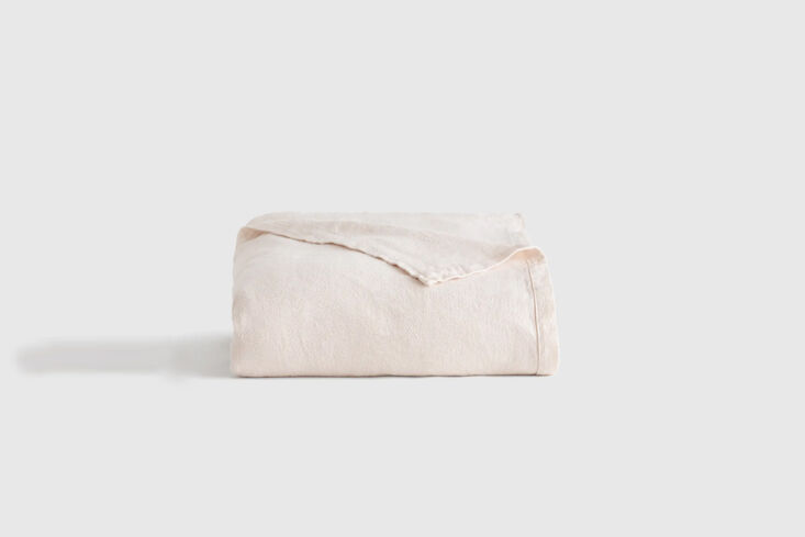
- The Base: A crisp, vintage-washed linen duvet cover in a mid-tone blue.
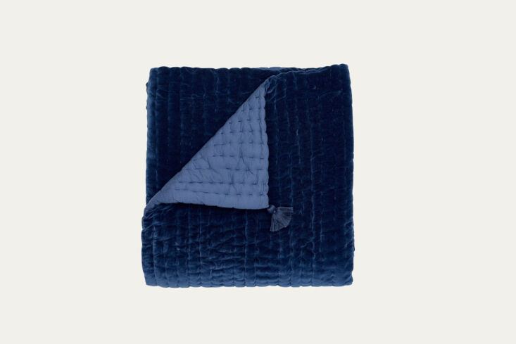
- The Middle: Quilted velvet blankets or shams to catch the light and add a sense of luxury.
- The Accent: A "break" color. Data shows that rooms utilizing monochromatic blue palettes are perceived as significantly more relaxing when paired with warm-toned natural textures. Mixing 'Blue Chambray' shams with an 'Oat' or 'Ecru' European bed cover provides a necessary neutral break, ensuring the room feels lived-in rather than a stage set.
Don't overlook the tactile nature of your surfaces. A velvet headboard in a shade slightly darker than your walls creates a beautiful layered effect.
Furnishing the Blue Boudoir: High-End Contrast
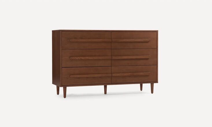
Once your "envelope" of blue is established, your furniture becomes the jewelry of the room. In 2026, the trend is moving away from light oaks and toward richer, more historic wood tones.
The Power of Tobacco and Walnut Blue and orange are opposites on the color wheel, which is why "Tobacco" stained wood and mid-century walnut look so incredible against blue walls. The orange undertones in the wood "pop" against the blue, providing a grounded, high-end contrast that feels classic yet contemporary.
Quiet Luxury Accents To lean into the "Quiet Luxury" aesthetic, opt for aged brass or gold hardware. The warmth of the metal acts as a brilliant highlight against the cool backdrop. Avoid chrome or polished silver, which can make a blue room feel cold and icy.
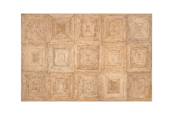
The Foundation of the Room For the floor, think organic. A jute or sisal rug adds a raw, textural element that balances the "velvety" nature of the drenched walls. This organic layer is essential for that 25% relaxation boost, as it connects the room back to natural elements.
Blue in Small Spaces vs. Primary Suites
The beauty of the blue-on-blue trend is its versatility, but your strategy should change based on the square footage.
- For Small Bedrooms: Many people fear dark colors in small rooms, but the opposite is true. Using a medium-to-dark blue-green (like Sea Salt or a dusty teal) across all surfaces actually makes the walls "recede" because the corners are less visible. It turns a cramped room into a jewel box.
- For Master Suites: Go for the full-room color drench, including the ceiling. In a large room, a white ceiling can feel like a "lid" that cuts the space off. Painting the ceiling the same shade as the walls creates a seamless, limitless feeling that is the epitome of the 2026 "hibernation cave."
FAQ
Q: Won't an all-blue bedroom feel too cold? A: It can if you use "pure" blues with high-contrast white furniture. The secret is using "muddy" blues (those with grey or green undertones) and layering in warm elements like wood, brass, and "Oat" colored textiles.
Q: Should I paint the ceiling blue too? A: If you want the true "double drenching" effect, yes! It creates a cocooning atmosphere that is incredibly conducive to sleep. If you're nervous, try a shade that is 50% lighter than your wall color for the ceiling.
Q: What lighting works best with monochromatic blue? A: Warm lighting is non-negotiable. Look for bulbs in the 2700K range. Blue walls absorb a lot of light, so utilize multiple light sources—dimmable wall sconces, a soft floor lamp, and perhaps a few candles—to create an inviting evening glow.
Ready to Drench Your Space?
Mastering the blue-on-blue look is about embracing the mood. It’s a design choice that says you value rest, serenity, and a bit of drama. As we move into 2026, don't be afraid to step away from the safety of "greige" and "off-white." Start with a swatch of a deep, smoky navy, find a complementary mid-tone for your trim, and watch as your bedroom transforms into the ultimate sanctuary.