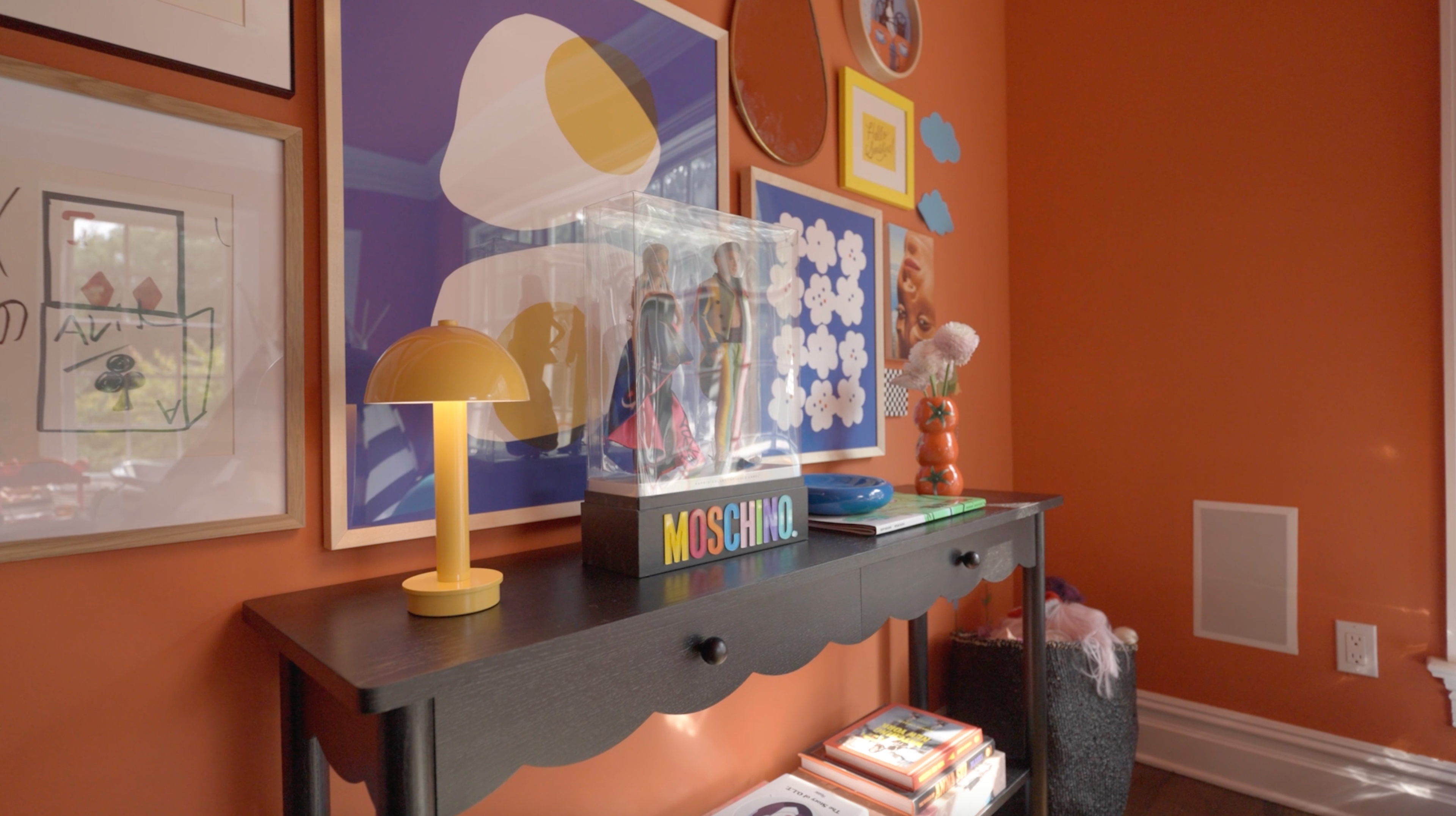
There is a specific kind of magic that happens when you stop treating a room as a collection of furniture and start treating it as a "dressed" space. If you’ve ever followed the career of Dani Stahl—the legendary fashion editor and style maven—you know that her approach to aesthetics is less about matching and more about a sophisticated, narrative-driven collision of textures. In the world of interior design, we are currently witnessing a seismic shift. For over a decade, the industry bowed at the altar of "Quiet Luxury" and "Beige Minimalism." But as we look toward 2026, the pendulum has swung.
The era of the "blank canvas" is over. We are entering the age of Joyful Maximalism, where textiles are no longer mere accessories; they are the protagonists of the home’s story.
The Rise of Modern Maximalism in 2026
If you feel a sudden urge to swap your cream linen sofa for a velvet mustard settee or layer a Persian rug over a geometric sisal, you aren't alone. A 2026 designer survey reveals that maximalism and eclecticism have officially become the most requested home aesthetics, surpassing minimalist styles for the first time in ten years. This isn't the cluttered maximalism of the past; it is a curated, fashion-forward approach that emphasizes personal history and bold visual statements.
The "Dani Stahl home decor style" is at the forefront of this movement. It treats a room like a high-fashion outfit—layering vintage finds and bold patterns over a high-quality "backbone" of furniture. In this new landscape, color is used with intention. The palette of 2026 is anchored by Chocolate Brown, Transformative Teal, and Butter Yellow. These aren't just colors; they are foundations that allow bold textiles to vibrate without overwhelming the senses.
To master this look, we must look at textiles through the lens of a stylist. It’s about building a visual hierarchy where one "star" piece is supported by a cast of textures, ensuring that the room feels vibrant rather than chaotic.
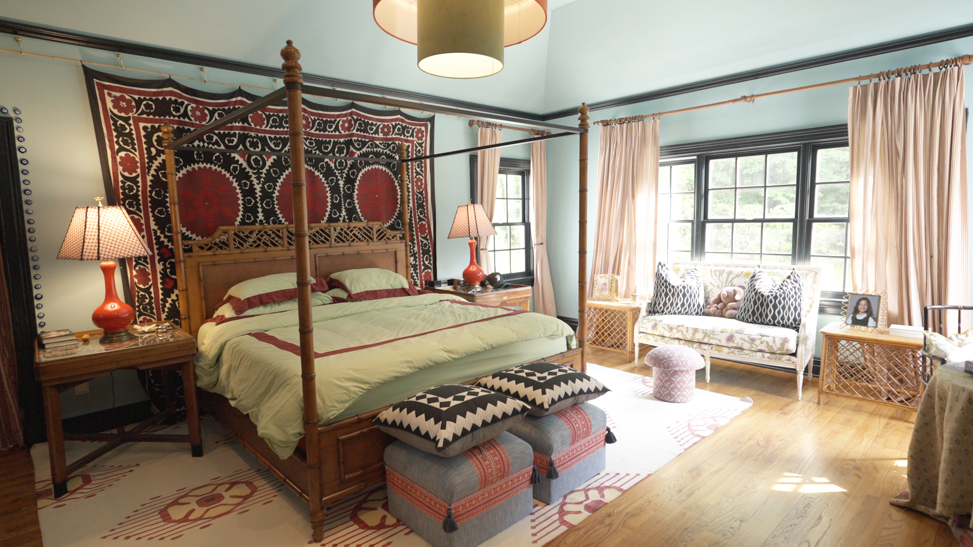
Rule 1: Establish Your Hierarchy with a 'Lead' Pattern
The most common mistake people make when attempting maximalist interior design trends is giving every pattern equal weight. When everything screams for attention, nothing is heard. To layer bold textiles like a pro, you must designate one "lead" pattern as the star of the room.
The lead pattern is typically the largest or most vibrant textile in the space—think of it as the "statement coat" of your room’s outfit. This could be a large-scale floral rug, a scenic tapestry, or a bold ikat-upholstered armchair. Once this piece is established, every other textile choice should be made in relation to it.
Pro-Tip: The 60-30-10 Ratio For a balanced maximalist space, aim for 60% lead pattern or primary texture, 30% supporting secondary patterns or textures, and 10% solid "palette cleansers." This ensures the room feels cohesive rather than cluttered.
Choosing your "backbone" pieces is the first step. If you have a neutral sofa, your lead pattern might be a large area rug. If your floor is a simple hardwood, perhaps the lead pattern is the floor-to-ceiling drapery. By establishing this hierarchy, you create a point of entry for the eye, allowing the viewer to process the layers in a logical order.
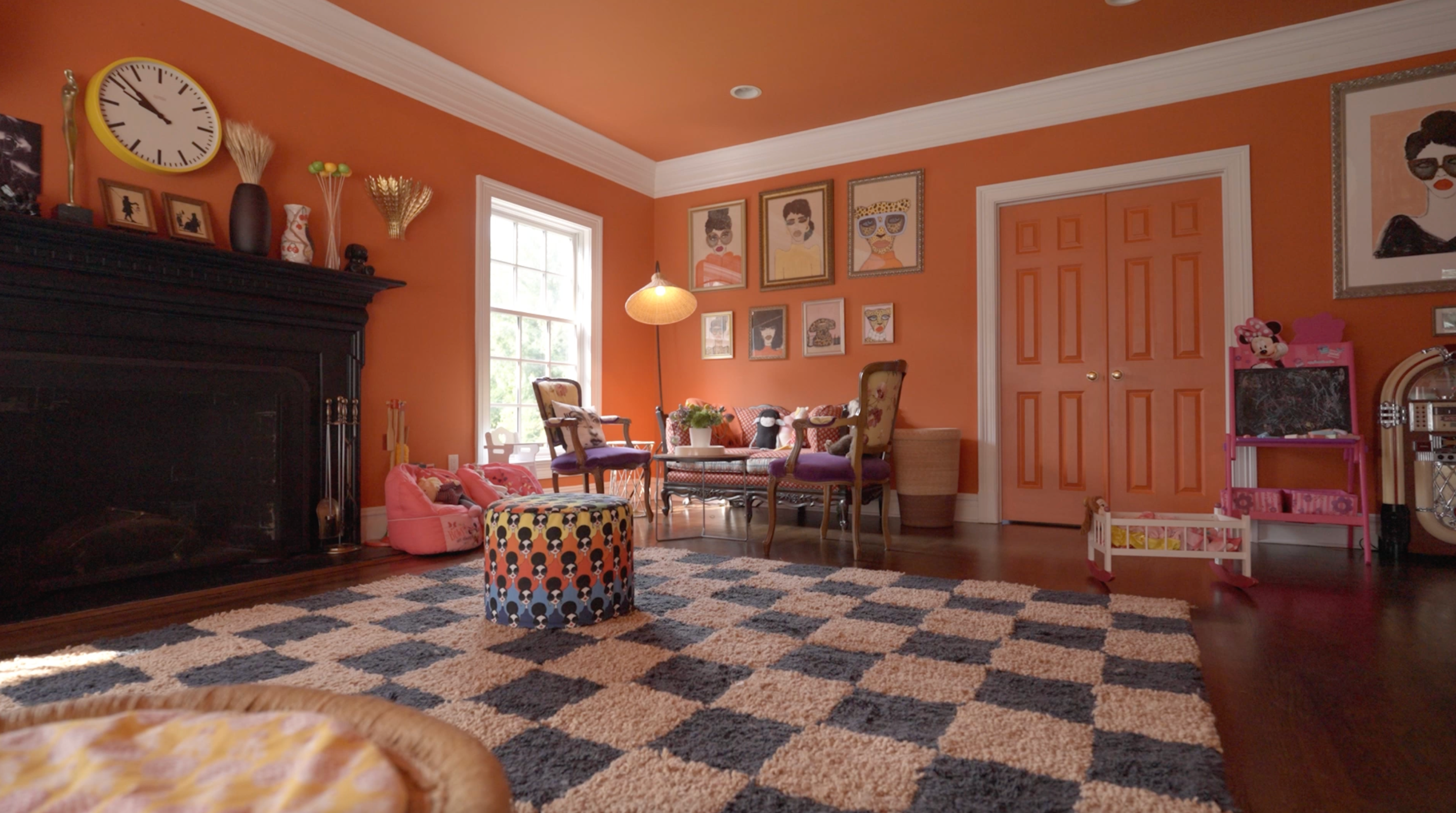
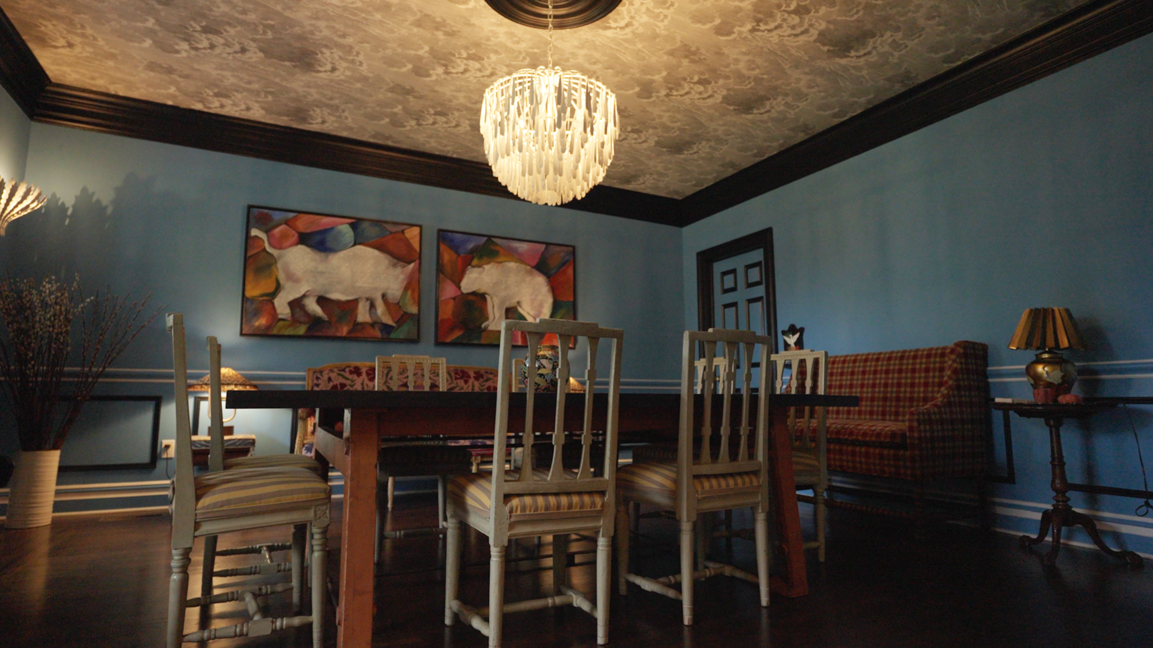
Rule 2: Mastering the Art of Pattern Clashing
Once your lead pattern is in place, it’s time to introduce the supporting players. Fashion-inspired home styling thrives on "clashing," but there is a science to the discord. The secret lies in varying the scale and mixing pattern families.
1. Varying the Scale
If your lead pattern is a large, sweeping botanical print, your secondary pattern should be significantly smaller. Think of a micro-check, a thin pinstripe, or a small-scale geometric. If both patterns are the same size, they will compete for visual dominance, creating a "shimmer" effect that is tiring to the eye.
2. Mixing Pattern Families
Contrast is the soul of interest. Pairing like-with-like (e.g., two different florals) is difficult even for professionals. Instead, aim for a mix of "Geometric" and "Organic."
- Geometric: Stripes, checks, grids, and Greek keys provide a sense of order and structure.
- Organic: Florals, animal prints, ikats, and botanicals provide movement and softness.
For example, a leopard print pillow (organic) looks undeniably chic when placed against a navy pinstripe sofa (geometric). The stripes provide a "frame" for the wildness of the print.
Rule 3: The Fashion Expert’s Secret — The 'Squint Test'
Dani Stahl often speaks about the "feeling" of an outfit, and the same applies to a room. When you are deep in the process of layering silks, velvets, and wools, it’s easy to lose perspective. This is where the "Squint Test" becomes your most valuable tool.
How to perform the Squint Test: Step to the doorway of the room, take a deep breath, and squint your eyes until the details of the room blur. What do you see?
- The Goal: You should see a cohesive color story. Even if there are twenty different patterns, they should resolve into a unified palette (e.g., "warm autumnal tones" or "cool seaside blues").
- The Warning Sign: If one element jumps out as a jarring, isolated block of color that doesn't relate to anything else, the balance is off.
To pass the Squint Test, use a unified color palette to bridge clashing motifs. If your rug is a mix of Burgundy and Turquoise, ensure that your throw pillows and curtains pick up at least one of those shades, even if the patterns are completely different.
| Feature | Quiet Minimalism (2015-2024) | Joyful Maximalism (2026 Trend) |
|---|---|---|
| Primary Palette | White, Gray, Greige | Chocolate, Teal, Ochre |
| Textile Focus | Smooth Linens, Bouclé | Velvet, Brocade, Silk, Fringe |
| Pattern Strategy | Tone-on-tone or Solid | High-contrast Scale Mixing |
| Philosophy | "Less is More" | "More is a Memoir" |
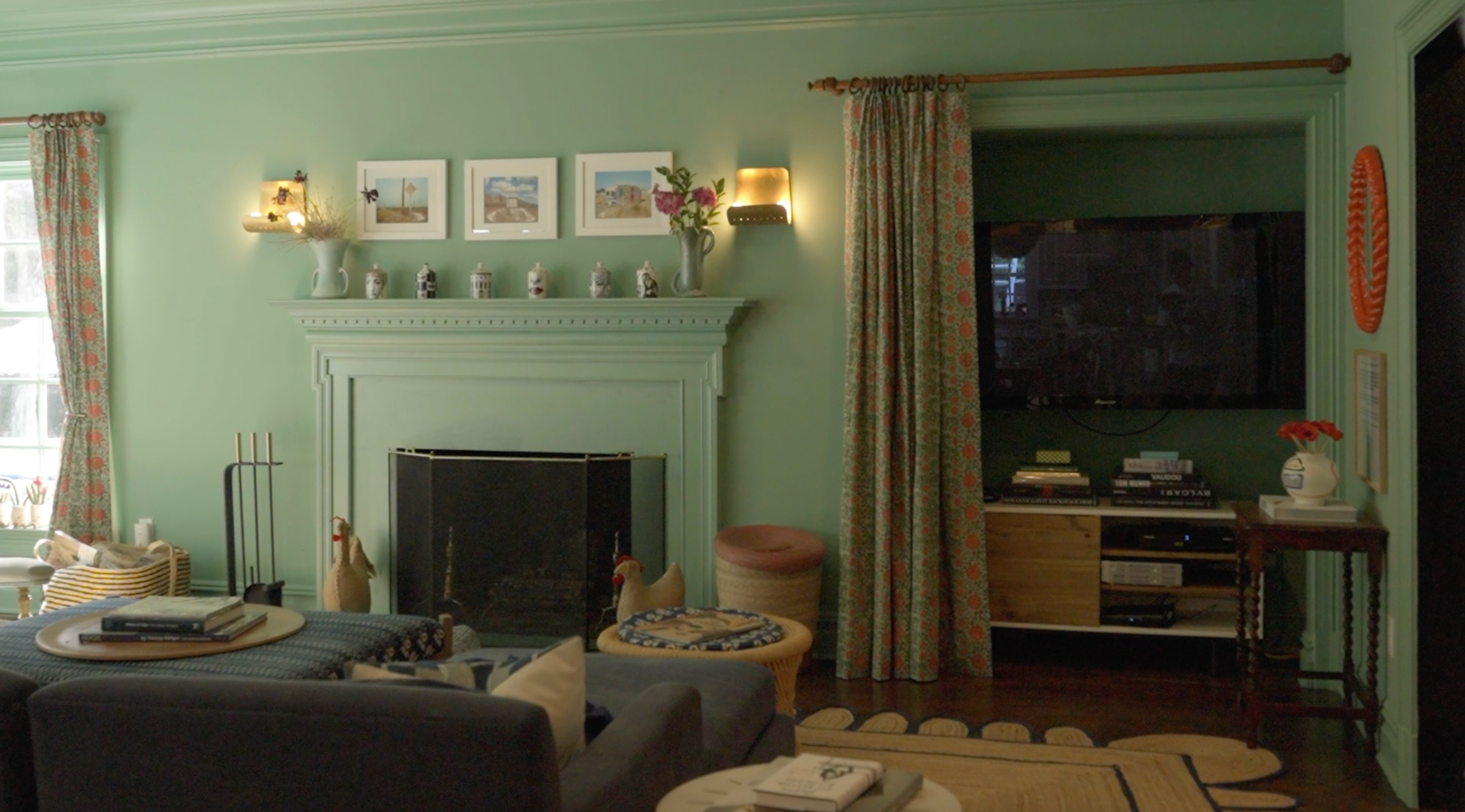
Pro-Tip: Incorporate 'Neutral Anchors' Every bold room needs a place for the eye to rest. These are your "palette cleansers." Use a solid velvet pillow in a deep chocolate brown or a simple cream throw to break up intense pattern clusters.
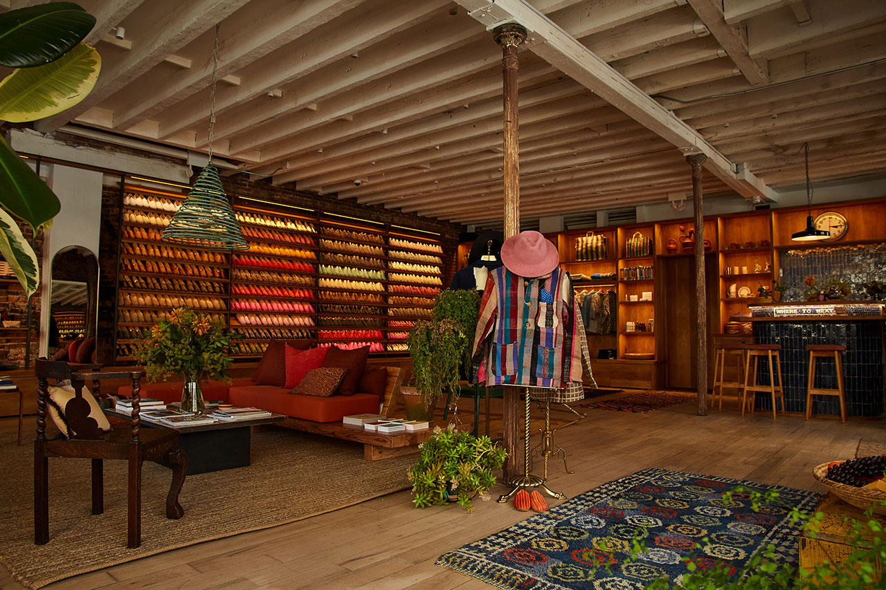
Layering with History: The Vintage Investment
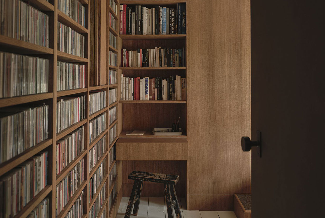
One of the reasons the 2026 maximalist trend feels so sophisticated is that it is fundamentally "investment-minded." Unlike the "fast furniture" cycles of the past, this aesthetic relies heavily on vintage and antique textiles. Designers are currently specifying 30% or more vintage items in their 2025-2026 projects, noting that an old textile carries a "weight" and patina that new fabrics simply cannot replicate.
Think of an inherited lace linen used as a runner over a modern lacquered table, or a vintage Suzani draped over a contemporary headboard. These layers provide what I call "Texture-Maxxing"—the art of piling on history until the room feels like a lived-in memoir.
Investment-minded maximalism also means choosing fabrics that age beautifully. Instead of synthetic blends, look for:
- Mohair and Velvet: For depth and light-play.
- Heavyweight Linen: For a relaxed, tactile "backbone."
- Embroidered Silks: For a touch of jewelry-like shimmer.
By sourcing vintage textiles, you ensure your home isn't a carbon copy of a showroom floor. It becomes a curation of your travels, your family history, and your evolving taste.
Conclusion: Your Ever-Evolving Narrative
Mastering the art of layering bold textiles is not about following a rigid set of rules; it’s about developing your "eye" through experimentation. Like Dani Stahl’s wardrobe, a layered home is never truly "finished." It is a living, breathing entity that evolves as you find a new vintage rug in an antique market or swap out your summer cottons for winter velvets.
Remember that your home is the most intimate garment you will ever wear. Don't be afraid to let it be loud, let it be colorful, and most importantly, let it be you. Use the 60-30-10 ratio as your guide, the Squint Test as your editor, and your own intuition as your stylist.
FAQ
Q: Can I use bold textiles in a small apartment without making it feel cramped? A: Absolutely. In fact, bold textiles can often make a small space feel more expansive and "jewel-box" like. The key is to keep the "lead" pattern to one major element (like a rug) and use mirrors to reflect the light and colors, preventing the patterns from feeling heavy.
Q: How do I know if two patterns definitely don't work together? A: If you look at the combination and feel a sense of physical agitation rather than curiosity, trust your gut. Usually, the culprit is "Competing Scales"—both patterns are the same size. Try swapping one for a much smaller or much larger motif.
Q: What is the best "beginner" bold textile to start with? A: A high-quality animal print (leopard or cheetah) in a small dose, like a throw pillow or an ottoman. Animal prints act as "neutrals" in the design world because they contain shades of brown, black, and tan, making them the perfect bridge between different colors and patterns.
Ready to transform your space? Start with one "lead" textile today and watch how the rest of your room begins to dress itself around it.