There is a quiet magic in stepping inside an architect’s private sanctuary. We often call it the "Shoemaker’s Shoes" phenomenon—the curiosity of seeing how a professional, who spends their days solving spatial puzzles for others, finally resolves their own. In the heart of Paris’s historic Marais district, architect Camille Hermand has provided us with a masterclass in urban evolution. By transforming a former 19th-century jewelry boutique into a 1,400-square-foot family duplex, she hasn't just built a home; she has created a blueprint for modern family living that balances historical soul with ruthless efficiency.
The Transformation: From Commercial Boutique to 100% Utility Home
The challenge was significant: how to turn a deep, ground-floor commercial space into a functional four-bedroom home for a growing family. The solution lay in vertical integration. By connecting the boutique space to the floor above, Hermand achieved a 100% increase in utility, transitioning the property from a single-use workspace to a multifaceted family dwelling.
What makes this project stand out to me as an editor is the reverence for history. Rather than gutting the space to create a sterile "white box," Hermand preserved the 19th-century timber frames and the original dairy market tiling. The layout is strategically split to manage the chaos of family life:
- The Ground Floor: Acts as the social engine of the home, housing the kitchen, dining area, and living room.
- The Upper Floor: Reserved for privacy, containing the four bedrooms and bathrooms.
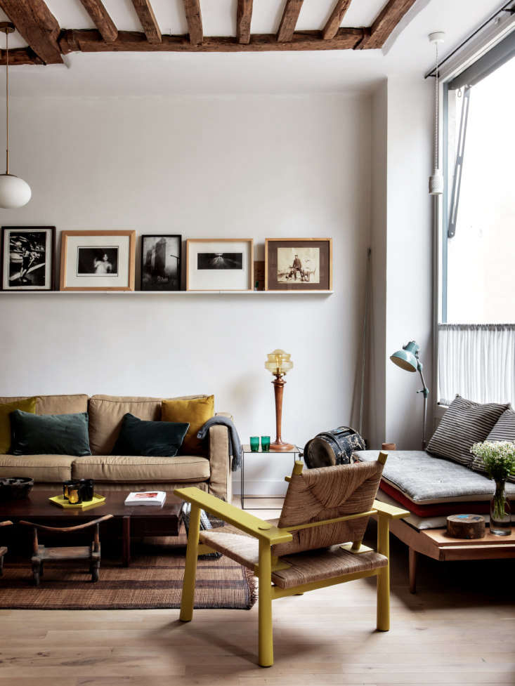
This vertical separation allows the "public" areas of the home to remain open and airy, while the private quarters offer a sense of retreat from the bustling Parisian streets outside.
Lighting Mastery: The 'Borrowed Light' Strategy
The most common grievance I hear from urban dwellers is the lack of natural light in deep, narrow apartments. Camille Hermand’s home offers a definitive answer: "Borrowed Light."
To maximize light in a deep urban apartment, you must move away from the traditional 19th-century solid-wall layout. Hermand utilized interior glass partitions, often referred to as 'atelier doors' or industrial-style windows. By replacing solid walls with glass, the apartment increases natural light distribution into central hallways by an estimated 40%.
Pro Tip: The Screen Effect Instead of using floor-to-ceiling glass which can sometimes feel too exposed, use exposed wall timbers or wooden slats. These act as "screens"—they provide a physical boundary and a sense of architectural rhythm while allowing sunlight to filter through the gaps.
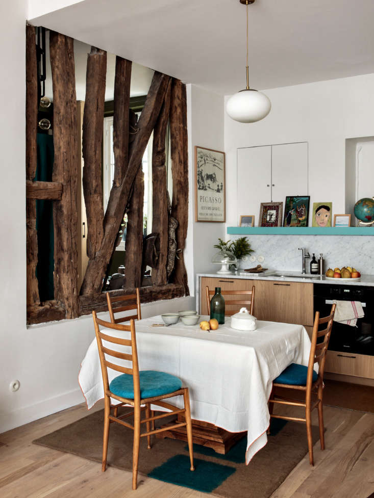
This strategy turns the hallway from a dark "dead zone" into a bright, inviting gallery space. It’s a technique that works regardless of your budget; even a simple internal window cut into a non-structural wall can transform a windowless room.
The Bespoke Budget Kitchen: Customizing the Ordinary
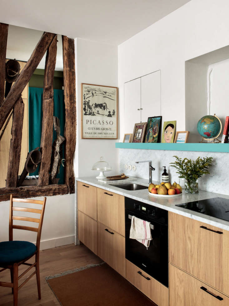
Perhaps the most relatable lesson from Hermand’s home is her approach to the kitchen. In an industry where "custom" often translates to "extravagant," she proves that luxury is more about curation than cost.
The architect’s secret for a high-end look on a budget? The IKEA Hack.
Hermand used standard IKEA Ekestad cabinets as the foundation. These are reliable, functional, and affordable. However, she elevated them by investing the saved budget into "touchpoints" that exude luxury:
- High-End Marble: Replacing standard laminate with thick marble countertops and a matching backsplash.
- Integrated Niches: Using existing wall recesses for storage rather than installing more upper cabinets, which can make a small kitchen feel cramped.
- The 'Pantry Closet': A dedicated tall cabinet for appliances keeps the marble surfaces clutter-free.
| Feature | Traditional Budget Kitchen | Hermand’s Bespoke Approach |
|---|---|---|
| Cabinetry | Standard off-the-shelf | IKEA frames + custom handles |
| Countertops | Laminate or quartz | High-grade Marble |
| Storage | Heavy upper cabinets | Recessed niches & hidden pantry |
| Light | Single overhead fixture | Layered task & ambient lighting |
Zoning for Family Life: The 'Path Test' in Practice
In an open-concept layout, the biggest risk is that the space feels like a furniture showroom rather than a home. Hermand avoids this by meticulously defining functional zones without the use of solid walls.
To define these zones, she employs the "Path Test." Before placing a single piece of furniture, map out your most frequent routes: from the entry to the kitchen, from the bedroom to the bathroom, from the sofa to the bookshelf. Once these paths are clear, you define the "stationary" zones around them.
How to create boundaries without walls:
- Paint as a Divider: Hermand uses Farrow & Ball’s Hague Blue for the library area, creating a visual "box" that feels separate from the white-walled living room.
- Rug Anchoring: Large area rugs act as the "islands" upon which furniture sits, grouping pieces together.
- Varied Lighting Heights: A low-hanging pendant over a dining table creates an intimate "room-within-a-room" effect.
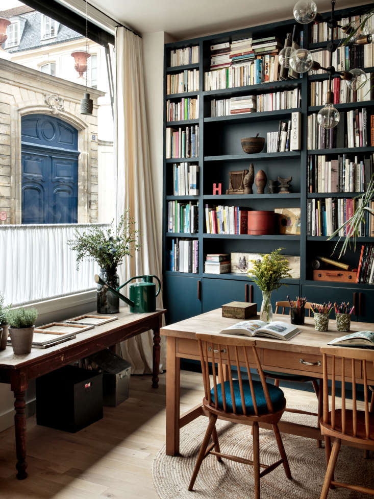
The Path Test Pro Tip: If you find yourself bumping into the corner of a table or having to walk "around" a chair to get to the fridge, your zones are misaligned. Clear paths should be at least 36 inches wide to maintain a sense of airy flow.
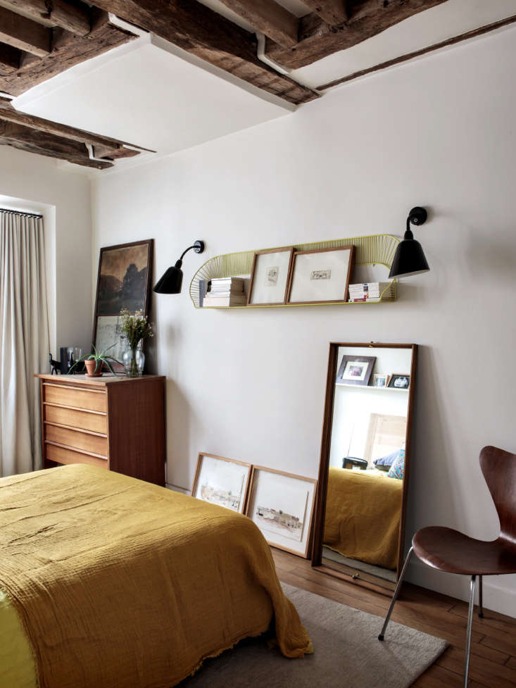
Interior Styling: The Bohemian Modern Aesthetic
The styling of the duplex is what I call "Bohemian Modern"—a blend of architectural rigor and collected comfort. It reflects a trend we are seeing for 2026: a move toward "New Neutrals."
Instead of the cool, sterile greys that dominated the last decade, Hermand opts for warmer tones like Farrow & Ball’s Strong White. These provide a soft backdrop for her mix of flea market finds from St. Ouen and mid-century Scandinavian classics.
Key 2026 Styling Trends found in this home:
- Sculptural Edges: Using rounded-edge sofas and African wooden stools to soften the rigid lines of the 19th-century timber frames.
- Tactile Layers: Linen curtains, velvet cushions, and woven rugs add "visual weight" and warmth to the ground floor’s stone floors.
- Painterly Wallpaper: Used in the bedrooms to add depth and personality without cluttering the floor space.
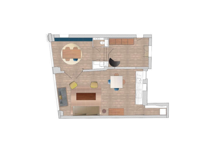
Floor Plan Evolution: Applying Lessons to Your Home
When we look at the 2D floor plan of this duplex, the brilliance is in the "Goldilocks" distribution of space. Even in a 1,400-square-foot home, no room feels too large or too small.
For those of you living in two-bedroom apartments or smaller studios, the takeaway here is the split-bedroom concept. By placing bedrooms at opposite ends or on different floors, you maximize acoustic privacy—a must for urban families. Furthermore, the transition of the former ground-floor office into a cohesive social hub demonstrates that any space, no matter how commercial or "cold" it feels initially, can be warmed up through intentional zoning.
Conclusion: Making Every Square Foot Earn Its Keep
Camille Hermand’s Marais duplex is more than just a beautiful home; it is an argument for intentional living. In an era where urban space is at a premium, we cannot afford to have "dead" hallways or "just-for-show" dining rooms.
By using the "borrowed light" strategy, embracing the high-low mix of IKEA and marble, and rigorously testing the paths of daily life, Hermand has created a home that earns its keep. It is a space that respects its 19th-century bones while providing a 21st-century family with the light, flow, and utility they need to thrive.
FAQ
1. Is "Borrowed Light" practical for a renter who cannot install interior windows? Absolutely. While you may not be able to cut into walls, you can achieve a similar effect using large mirrors placed opposite windows to bounce light into darker corners, or by replacing heavy solid doors with "French-style" glass pane doors that can be swapped back when you move out.
2. Does the IKEA kitchen hack actually hold up over time? Yes, provided you focus on the quality of the "wear" surfaces. IKEA cabinet boxes (the frames) are quite standard across the industry. By investing in high-quality marble or stone for the countertops and durable hardware (handles/hinges), you ensure the areas you touch and use daily feel premium and last for years.
3. How do I start the "Path Test" in my own home? Start with a roll of painter's tape. Spend a Saturday morning marking out your "natural" walking routes on the floor. If your tape crosses through a coffee table or a bulky armchair, you know exactly where your layout is creating friction.