Quick Facts
- Difficulty Level: Intermediate (requires patience and precision).
- Time Commitment: 1–2 days, depending on the complexity of the design.
- Cost: $50–$150 (inclusive of high-quality paint and professional-grade tape).
- Key Benefit: Strategic vertical geometric patterns can increase the perceived ceiling height of a room by up to 12%.
- Efficiency Hack: Using integrated paint-and-primer formulas can reduce total DIY completion time by approximately 30%.
Color is perhaps the most democratizing tool in interior design. It doesn't require a structural renovation to change the soul of a room; it simply requires a vision and a steady hand. For years, we’ve seen the "feature wall" evolve from a single bold color to the sophisticated, architectural art form known as color blocking. As we look toward the design trends of 2026, the focus has shifted away from the high-contrast "shock" colors of the 2010s toward more "considered" palettes—tones that feel grounded, organic, and intentional. Color blocking today isn't just about making a statement; it’s about "dopamine anchoring," creating specific zones in your living room that evoke joy and provide a sense of visual stability.
The Evolution of Color Blocking: Why 2026 is the Year of the Accent Wall
The transition from the minimalist "all-white" era to a more maximalist, expressive aesthetic has paved the way for modern color blocking. We are seeing a move toward "chromatic tension"—the practice of placing unexpected colors side-by-side to create a sense of energy without overwhelming the senses. But beyond the aesthetics, there is a deep-seated psychology at play.
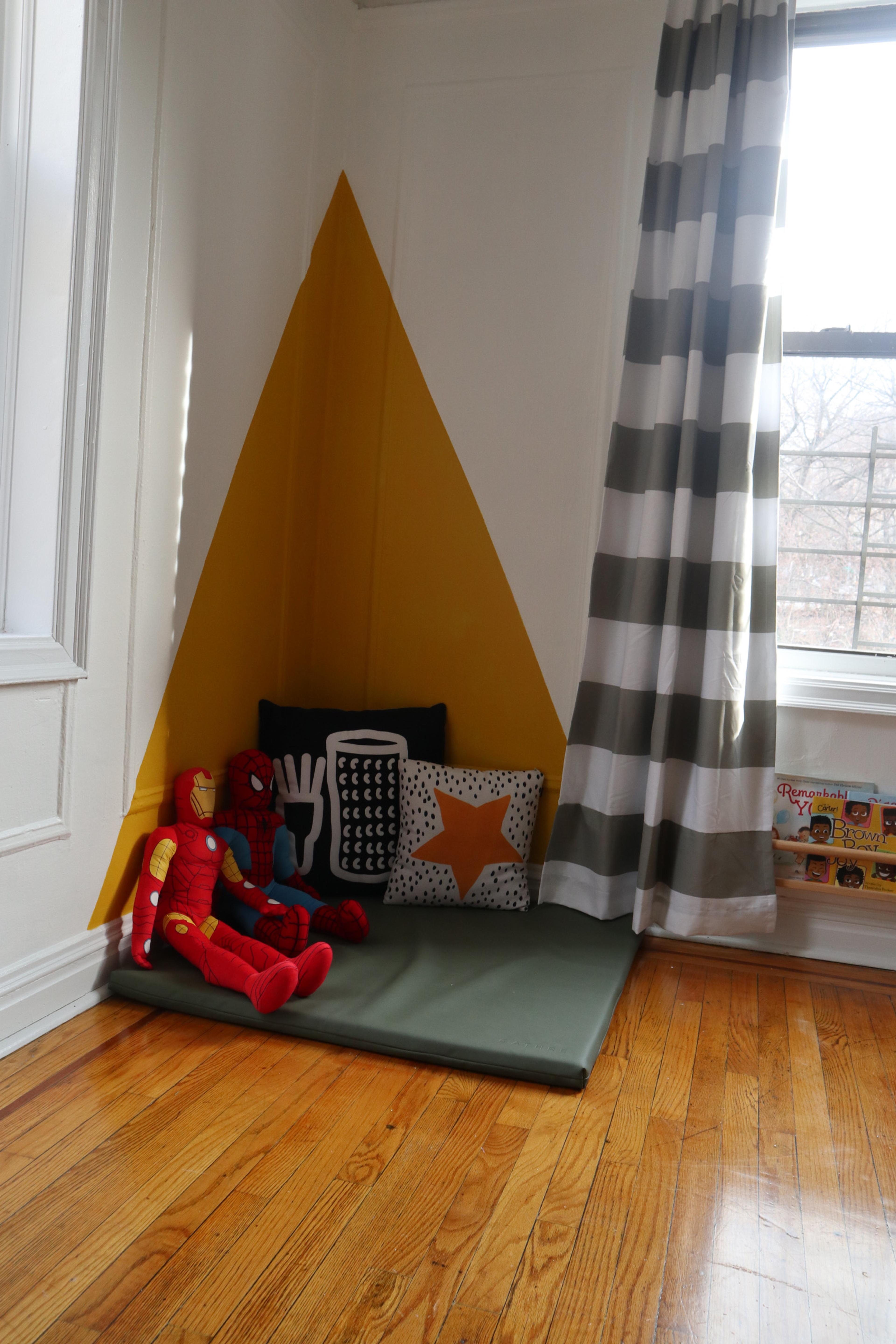
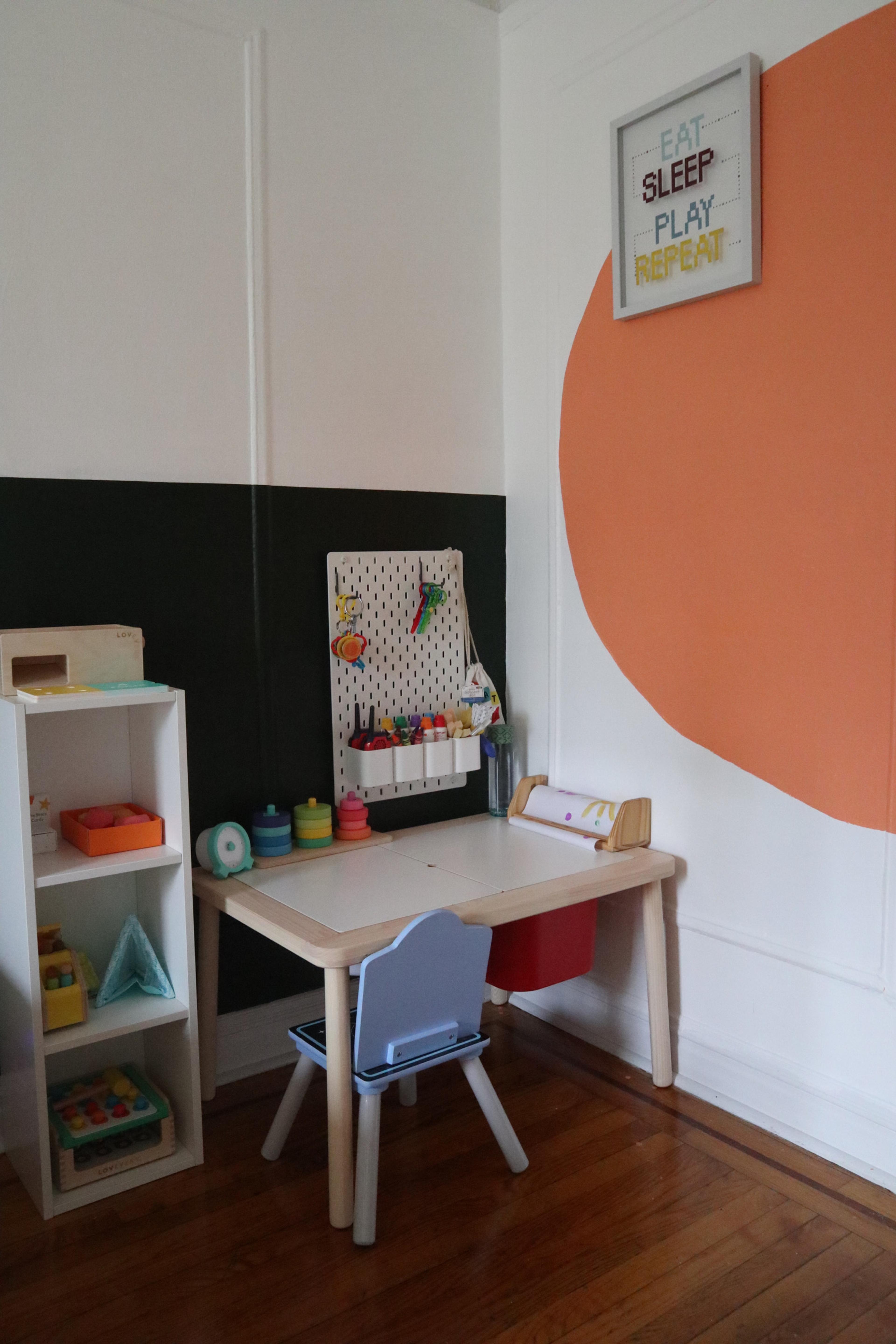
Interior design studies indicate that strategic color blocking can increase the perceived ceiling height of a room by up to 12% through vertical geometric patterns. By drawing the eye upward with a tall, narrow block of color or a soaring triangle, you effectively "stretch" the architecture of a standard living room. This isn't just paint; it’s a visual correction tool.
Planning Your Design: Beyond Simple Shapes
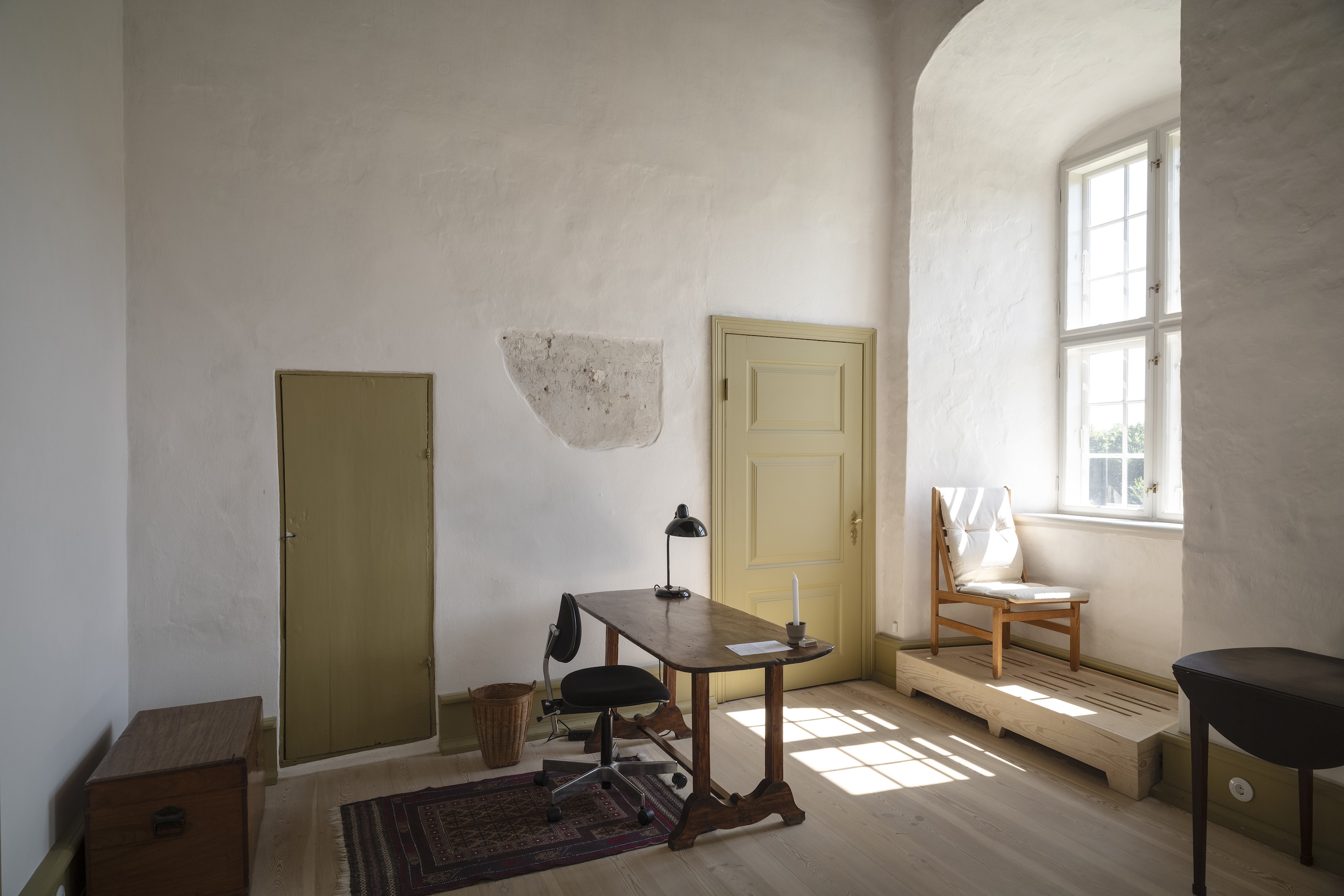
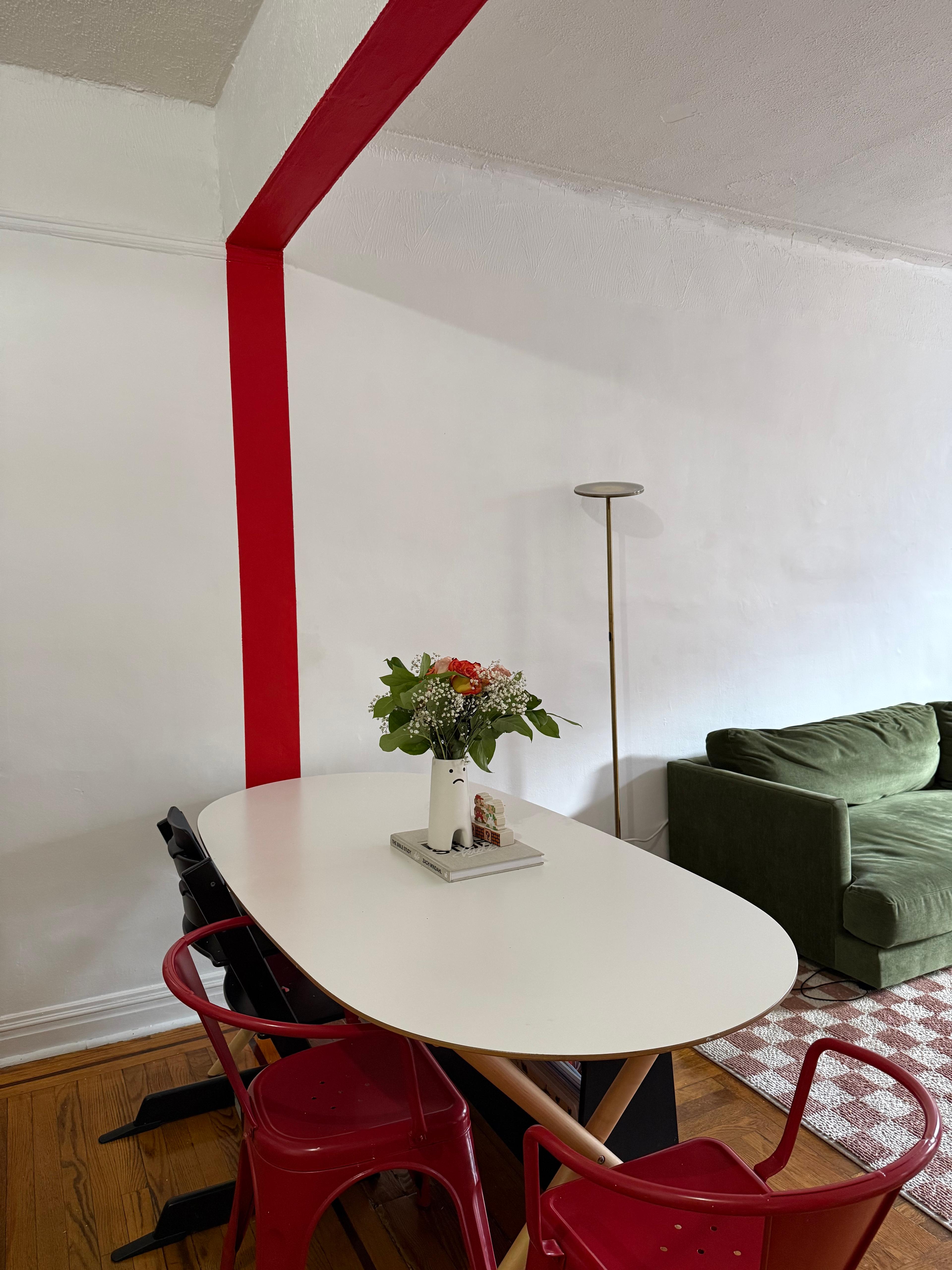
Before you crack open a can of paint, you must consider the "flow" of your home. One of the most sophisticated ways to use this technique is through architectural framing. Color blocking can create visual flow by echoing a specific hue from one room into the next through architectural framing, such as painting around doorways or windows. This creates a "portal" effect that makes the transition between spaces feel seamless and curated.
When selecting your technique, consider these three modern approaches:
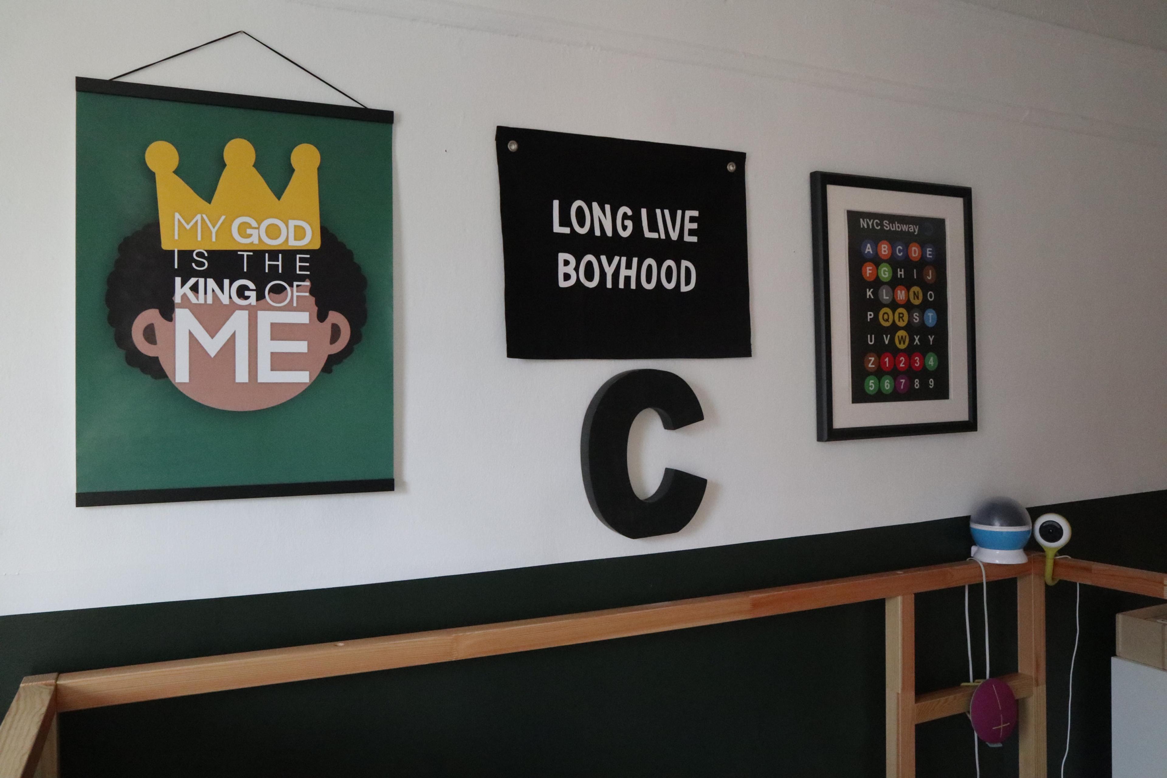
- Color Capping: Painting the bottom third or half of the wall in a darker shade, providing a "grounded" feel that mimics traditional wainscoting but with a modern edge.
- Color Drenching: Taking a block of color and extending it across different surfaces—the wall, the trim, and even the radiator—to create a monolithic, high-end look.
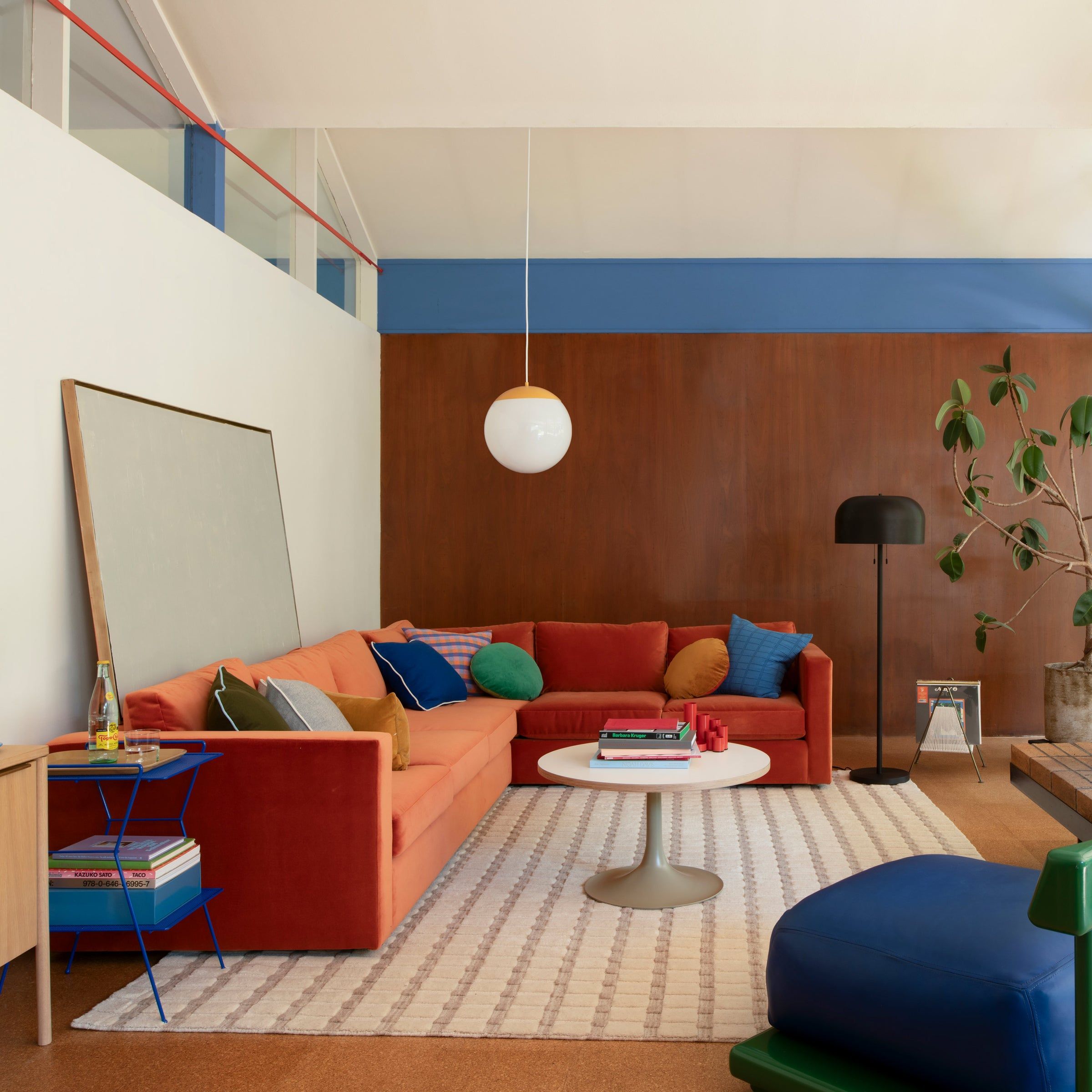
- Chromatic Tension: Using two colors of similar "weight" but different hues—like a dusty plum against a sage green—to create a sophisticated vibration in the room.
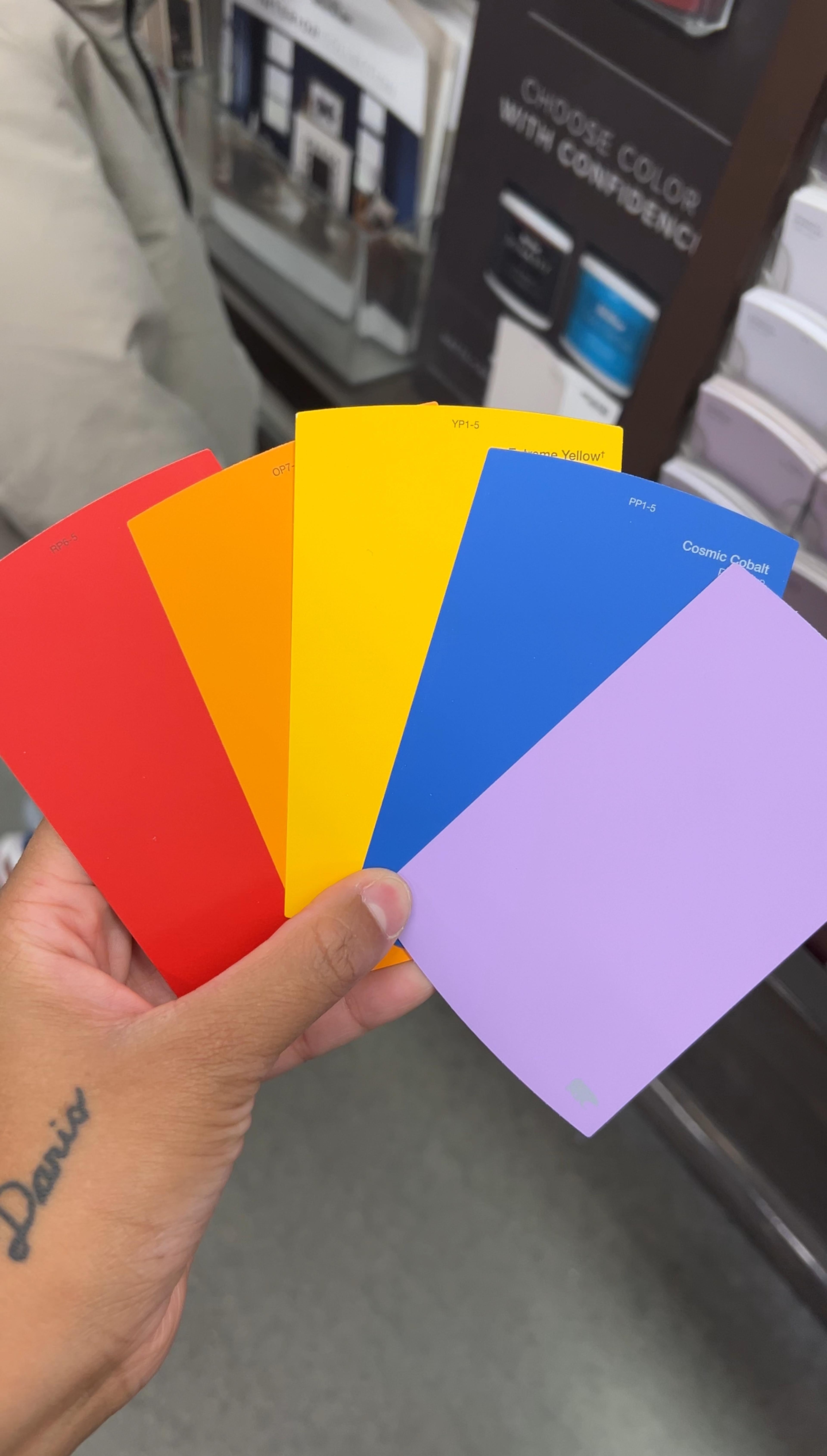
For 2026, we are moving away from primary colors and toward "new neutrals." Think taupe paired with a deep, moody plum, or a creamy latte juxtaposed with a rustic, sun-baked rust. Soft sand paired with burnt sienna is another favorite for creating a Mediterranean-inspired warmth.
The Professional DIY Tool Kit
To achieve the "Ivy Chen" look—which is to say, a finish that looks like you hired a high-end contractor—you cannot skimp on tools. Essential tools for a DIY color-blocked wall include painter's tape, a wall sander for smoothing, primer (if not using a 2-in-1), rollers for large sections, and a small angled brush for precision edges.
| Brand | Best For | Ivy's Take |
|---|---|---|
| Sherwin-Williams (Emerald Line) | Durability & Washability | Excellent for high-traffic living rooms; the finish is buttery smooth. |
| Benjamin Moore (Aura) | Color Accuracy | If you are chasing a very specific "plum" or "terracotta," their pigment technology is unmatched. |
| Behr/Valspar | Budget-Friendly | Great coverage for the price; their Marquee line is a solid "one-coat" contender. |
Pro-Tip: Using integrated paint-and-primer formulas for color blocking projects can reduce total DIY completion time by approximately 30% compared to traditional layering. It allows for faster recoating, which is essential when you have multiple colors meeting on one surface.
Step-by-Step Tutorial: Achieving Crisp, Pro-Level Lines
Step 1: Wall Preparation
The secret to a professional finish is 90% preparation. Start by using a wall sander to smooth out any previous drips or textures. Wipe the walls down with a damp microfiber cloth to remove dust. If the wall is greasy or near a kitchen area, a light wash with TSP (trisodium phosphate) ensures the paint adheres perfectly.
Step 2: Mapping the Design
Don't wing it. Use a pencil and a long measuring tape to sketch your geometric or abstract shapes. For circles, use the "string and pencil" method (tack a string to the center point and rotate the pencil around it). For straight lines, a laser level is your best friend.
Step 3: The Tape Masterclass
This is where most DIYers fail. Apply a high-quality, low-tack painter's tape (like FrogTape) along your pencil lines.
The Sealing Hack: To ensure zero bleed-through, paint over the edge of the tape with your base wall color (the color already on the wall). This seals the edge of the tape. If any paint leaks under the tape, it’s the color that’s already there! Once dry, proceed with your new accent color.
Step 4: Priming and Painting
Apply your color-block paint using a roller for the main body and a small 1" or 2" angled brush for the edges. Work in thin, even coats. Because you're likely using a vibrant or deep shade, two coats are almost always necessary for depth of color.
Step 5: The Perfect Reveal
The most satisfying—and nerve-wracking—part. To achieve crisp lines when color blocking, apply high-quality painter's tape and remove it at a 45-degree angle while the paint is still slightly damp to prevent peeling. If you wait until the paint is bone-dry, the tape may pull up bits of the dried paint film, leaving a jagged edge.
Styling Your New Focal Point
A color-blocked wall shouldn't exist in a vacuum; it needs to be "introduced" to the rest of the room. I recommend coordinating textiles and furniture to support the wall's narrative without competing for attention. If you’ve painted a large arch in a terracotta shade, bring in a throw pillow or a rug that features a similar earthy tone.
Use ceramics, sculptural vases, and lighting to reference the secondary color-blocking shades. For instance, if your wall features a sliver of sage green, a matte green table lamp placed nearby will "pull" that color off the wall and into the 3D space, making the design feel integrated rather than just a "sticker" on the wall.
Troubleshooting Common DIY Paint Mistakes
Even with the best planning, things can go wrong. Here is how to fix the most common issues:
- Paint Bleed on Textured Walls: If you have orange-peel or knockdown texture, tape alone won't work. Use a 1/4" angled decorative brush to manually touch up the line using the base color. It requires a steady hand, but it’s the only way to get a clean line on heavy texture.
- Uneven Coverage: Dark colors like deep royal blue or charcoal black can sometimes look patchy. This is often due to "re-wetting" the paint too soon. Ensure you follow the recoat times on the can—usually 2 to 4 hours—and always maintain a "wet edge" while rolling.
FAQ
Q: Can I color block in a small living room without making it feel smaller? A: Absolutely. In fact, color blocking can make a room feel larger. By using "Color Capping" (painting the bottom half of the wall) and keeping the top half a lighter, reflective shade, you draw the eye horizontally, which can make a narrow room feel wider.
Q: What type of finish should I use for color blocking? A: I always recommend a Matte or Eggshell finish for the main wall. Glossy finishes reflect too much light, which can distort the geometric shapes and make the lines look less precise. Matte finishes absorb light, making the colors look richer and more "velvety."
Q: How do I choose colors that don't clash? A: Look at a color wheel. For a harmonious look, choose "analogous" colors (colors next to each other, like blue and green). For high energy, choose "complementary" colors (opposite each other, like orange and blue), but choose muted versions of them—think "Rust and Navy" instead of "Neon Orange and Bright Blue."
Call to Action
Ready to transform your living room into a modern masterpiece? Start by sketching your vision and choosing a palette that speaks to your personality. Remember, it’s only paint—if you don't love it, you can always evolve it. Share your finished DIY color-blocked walls with us on social media using #IvyChenDesign, and let’s inspire a more vibrant 2026 together!