Imagine stepping out of the harsh, fluorescent glare of the modern world and into a room that feels like a quiet exhale—a space where the walls are deep, the textures are rich, and the atmosphere is as layered as a glass of vintage port in a velvet-lined library. This is the essence of the "enveloping" aesthetic, a sophisticated departure from the sterile, high-contrast minimalism that has dominated our Instagram feeds for the last decade. As we look toward 2026, the interior design landscape is undergoing a profound psychological shift: luxury is no longer defined by how much "light and airy" space you have, but by how effectively your home can provide emotional comfort and a sense of retreat.
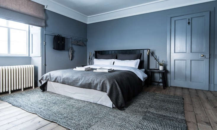
To master this moody monochromatic look, the secret lies in total immersion. You achieve this by maintaining absolute consistency in your undertones—ensuring all paint colors, furniture, and materials share the same cool-toned DNA, such as a base of Lulworth Blue accented by coal-colored textures. This isn't just a design choice; it's a movement. Interior design experts project a 65% increase in the adoption of "enveloping" dark jewel tones for residential spaces by the 2026 season, marking a decisive move toward grayish plums, deep burgundy, and dark walnut wood stains that create intimate, welcoming environments.
1. The 2026 Palette: From 'Cloud Dancer' to 'Patina Blue'
The journey into a cool-toned living space begins with the foundation: the color. While previous years favored the "Greige" movement, 2026 is about depth and "Patina." We are seeing a surge in what I call "high-risk, high-reward" colors—shades that demand commitment but offer unparalleled sophistication.
- The Anchor Colors: Look for Benjamin Moore’s 'Silhouette' (a sultry charcoal with a hint of plum) or Behr’s 'Hidden Gem' (a deep teal-inflected slate).
- The Transition Shades: Use cool-toned neutrals to prevent the space from feeling like a cave. Farrow & Ball’s 'Lulworth Blue' is an editor favorite for its ability to look both historic and modern simultaneously.
When selecting your palette, think of it as a gradient rather than a single color. By layering different saturations of the same cool hue, you create a sense of architectural volume that a single flat paint color can never achieve.

2. Maintaining Tonal Consistency: The Art of the Cocoon
The most common mistake in monochromatic design is the "discordant undertone." If your walls have a cool blue base, but your sofa has a warm yellow-grey undertone, the room will feel "off" rather than "moody." To achieve true sophistication, you must ensure that your furniture and materials speak the same tonal language as your walls.
One of my favorite techniques for 2026 is Color Blocking. This involves painting the ceiling, the baseboards, and even the crown molding in the exact same shade and finish as the walls. This erases the visual boundaries of the room, creating a seamless "cocoon" effect that makes the space feel larger yet more intimate. It’s a bold move that turns a standard living room into a cinematic experience.
Ivy’s Insider Tip: When color-blocking, use a "Dead Flat" finish for the walls and ceiling, but opt for a "Satin" or "Eggshell" in the same color for the trim. The slight shift in sheen provides just enough definition without breaking the monochromatic spell.
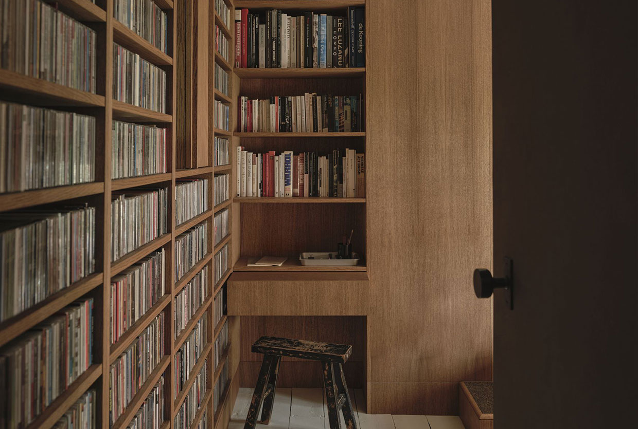
3. The 4-Texture Rule for Luxury Perception
Why do some dark rooms feel depressing while others feel like a five-star hotel suite? The answer is tactile variety. According to recent industry statistics, monochromatic room designs that utilize at least four distinct textures are 40% more likely to be perceived as "luxurious" by homeowners and guests.
In a cool-toned room, you need to balance the "slickness" of the color with "rougher" elements. Think of it as a sensory hierarchy:
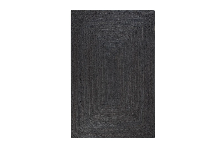
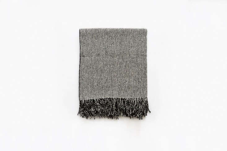
- The Ground: A coal-colored jute or sisal rug provides a coarse, organic foundation.
- The Comfort: A velvet armchair in a deep navy or slate offers a light-absorbing softness.
- The Accent: Aged metals (like blackened brass) or matte black wood stains add a structural edge.
- The Layer: Linen drapes or a chunky wool throw to soften the window lines.
By mixing these materials, you prevent the monochromatic palette from looking "flat." The way light hits a wool throw versus a matte-painted wall creates the shadow and highlights necessary for visual interest.
4. Masterclass in Ambient Lighting: Shadow as a Design Element
In a moody living space, what you don't light is just as important as what you do. To maintain the "enveloping" feel, you must abandon harsh overhead lighting. Big, bright recessed cans are the enemy of mood; they wash out the depth of your cool tones and make dark walls look muddy.
The best lighting for a moody living room involves low-level, ambient sources. Think of your lighting in three layers:
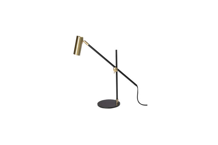
- Task Lighting: A sleek black brass desk lamp or floor lamp focused on a reading chair.
- Accent Lighting: Wall sconces that cast light upward and downward, highlighting the texture of the paint.
- Atmospheric Lighting: Dimmable "Tiffany-style" lamps or sculptural pendants that provide a warm, localized glow.
The goal is to create "pools" of light that allow the corners of the room to recede into shadow. This play of light and dark is what gives a cool-toned room its "soul."
5. Architectural Styling: The Shaker Peg Rail & Moldings
One trend I am particularly excited about for 2026 is the reinvention of the Shaker peg rail. Traditionally seen in rustic mudrooms, we are now seeing it used as a sophisticated architectural feature in living rooms.
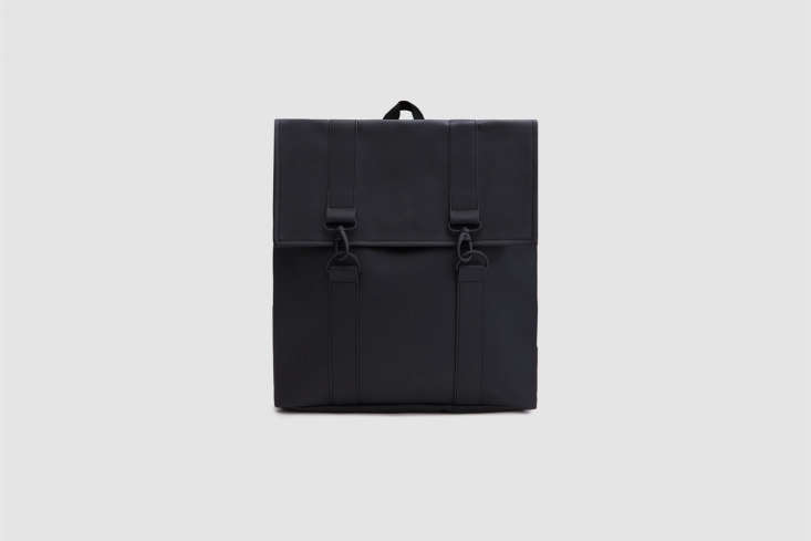
The "Birch Room" look involves installing a peg rail that runs the entire length of a wall, painted in the exact same cool-toned shade as the wall itself. This adds a subtle horizontal line that breaks up the verticality of the room without introducing a new color. It serves as "functional art"—a place to hang a curated selection of linen bags, a matte-finish backpack, or even a dried botanical sprig.

This styling choice adds a layer of "lived-in" authenticity to an otherwise highly-designed space. It suggests that while the room is sophisticated, it is also a place of utility and daily life.
6. Softening the Edges: Curved Furniture Trends
As we move into 2026, the rigid, sharp lines of mid-century modern are giving way to Bauhaus-inspired curves. In a moody, cool-toned room, these rounded silhouettes are essential. Because dark colors can feel "heavy," circular coffee tables, crescent-shaped accent chairs, and arched mirrors help to "soften" the space.
| Feature | Rigid/Traditional | 2026 'Moody' Trend |
|---|---|---|
| Sofa Shape | Rectangular/Boxy | Organic/Crescent |
| Coffee Table | Sharp Edges/Glass | Rounded Wood/Marble |
| Cabinetry | Shaker Square | Fluted/Tambour Curves |
| Seating | Metal Legs | Plinth Base/Upholstered |
These curves create a sense of flow, guiding the eye around the room and preventing the dark palette from feeling somber or stagnant.
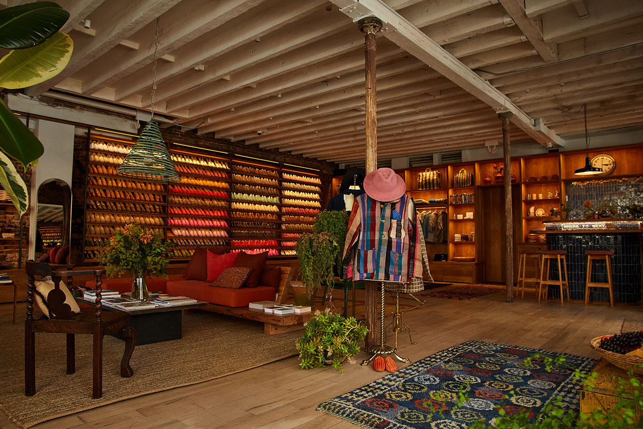
7. Curating the 'Themed' Nook
Finally, a sophisticated living space should feel curated, not decorated. One of the best ways to achieve this is by creating a dedicated "themed nook." Whether it’s a built-in home bar or a reading corner, this area should be the "jewel box" of the room.
Layer your artwork with intention. Against deep, saturated walls, I recommend using dark, edgy art pieces paired with antique or blackened frames. Don't be afraid to lean a large canvas against the wall on the floor or on a low shelf—it adds to that effortless, editor-curated vibe.
Get the Look: Cool-Toned Essentials
| Category | Product Type | Recommended Finish |
|---|---|---|
| Paint | Farrow & Ball Lulworth Blue | Dead Flat (Walls) |
| Textile | Charcoal Tweed Throw | Textured Wool |
| Hardware | Shaker Peg Rail | Color-matched to Wall |
| Lighting | Black Brass Sconce | Matte Finish |
FAQ
Q: Won't a dark, monochromatic room feel too small? A: Surprisingly, no. By painting the walls, trim, and ceiling the same dark color, you eliminate the visual "stops" that tell your brain where a room ends. This creates an infinite, "enveloping" effect that can actually make a small room feel grander and more intentional.
Q: How do I choose the right "cool" undertone? A: Look at the natural light in your room. If you have north-facing light (which is naturally blue), a cool-toned palette will feel very cohesive. Test your paint samples at different times of the day; a true cool-toned blue should never turn "muddy" or "green" in the evening.
Q: Can I mix wood tones in a cool-toned room? A: Yes, but keep them on the darker side. Dark walnut or ebonized oak stains work beautifully with cool blues and grays. Avoid "yellow" woods like pine or light oak, as they will clash with the sophisticated, moody vibe we are aiming for.