Ever feel like all eyes are on you as you power through your morning inbox? This June, they actually are—and in the most delightful, surrealist way possible. As we transition into the heat of summer, our digital and physical workspaces often begin to feel a bit stagnant, burdened by the clutter of mid-year deadlines. But a simple "palate cleanser" for your screen can do more than just aesthetic heavy lifting; it can fundamentally shift your creative frequency.
Research indicates that 72% of creative professionals report a noticeable increase in daily inspiration when utilizing high-contrast, surrealist digital backgrounds. This isn’t just about having something "pretty" to look at; it’s about breaking the visual monotony of spreadsheets and emails with something that challenges the eye and sparks the imagination. This month, we are thrilled to feature the work of a designer who excels at exactly that kind of visual disruption.
Meet the Artist: Sara Portieri
Based in the historic heart of Rome, Sara Portieri is a graphic designer who refuses to be pigeonholed. Her multidisciplinary work spans branding, illustration, and visual storytelling, but it is her unique brand of "humorous surrealism" that has caught the interior design world's attention. Portieri’s style is a bold, surrealist pop-art evolution that plays with perception, transforming everyday anatomical features into rhythmic, hypnotic patterns.
Her approach is inherently multidisciplinary. She treats a digital desktop with the same reverence as a gallery wall, ensuring that every composition balances negative space with vibrant, saturated energy. There is a certain wit in her work—a playful nod to the absurdity of modern life—that makes her designs feel like a shared joke between the artist and the viewer.
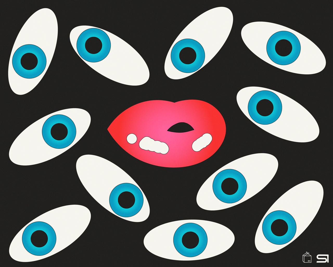
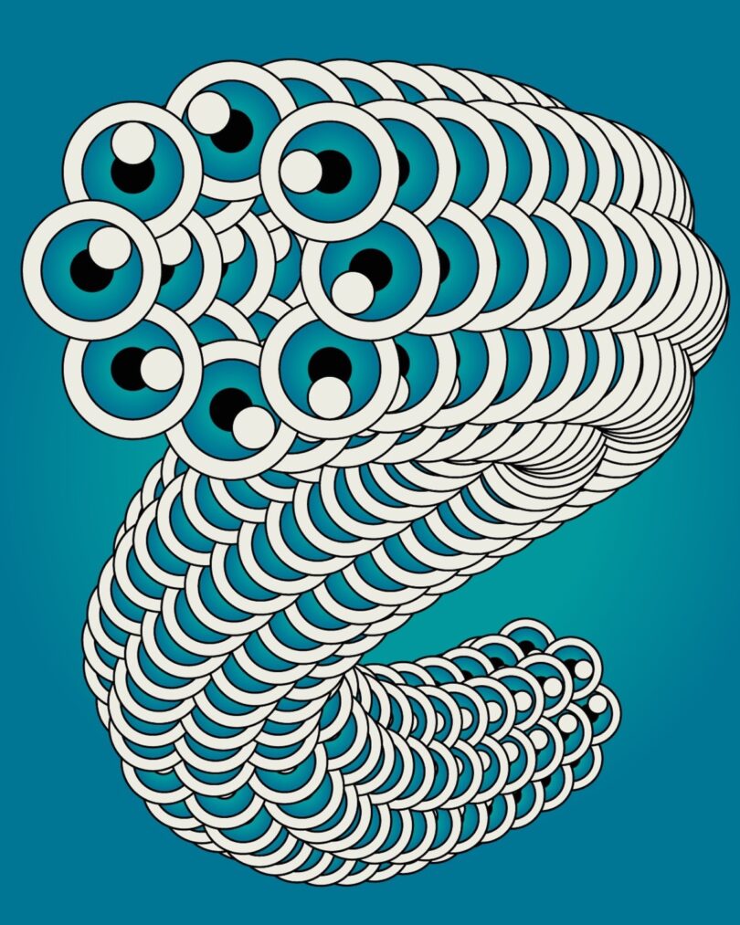
The June 2025 Designer Desktop: 'All Eyes on You'
The June 2025 Designer Desktop features a playful, surreal composition by Sara Portieri, showcasing a hypnotic formation of floating eyeballs and lips to create an unforgettable visual experience. Titled "All Eyes on You," this month’s selection moves away from the traditional floral or "beachy" June themes in favor of something with a definitive pop-art edge.
The color palette is intentional: high-contrast tones that pop against the standard grey and white interfaces of most software. The "unserious" and slightly "weird" vibe of the floating lips and blinking eyes serves as a reminder not to take the workday too seriously. It’s a maximalist statement for the digital age, perfect for those who find beauty in the unconventional.
Why Surrealist Art Works for Productivity
From an interior styling perspective, we often talk about "visual rest," but surrealism provides something different: "active engagement." Abstract and surrealist art is considered the gold standard for office environments because it reduces cognitive load and promotes energy through dynamic color accents without causing visual distraction. Unlike a landscape photo, which might pull your mind into a daydream, surrealist pop-art keeps the brain in a state of light, creative "play."
The science backs this up. Data shows that integrating abstract motion art or high-contrast surrealist imagery into high-pressure workspaces can reduce cognitive fatigue by up to 22% compared to traditional static photography. By presenting the brain with a "weird" or unexpected visual, you are effectively performing a micro-reset for your focus every time you minimize your windows.
- Dopamine Hit: Saturated colors, like those used by Portieri, trigger a minor dopamine release, helping to combat the "afternoon slump."
- Reduced Boredom: The complexity of the "All Eyes on You" pattern ensures that the eye always finds something new, preventing the visual boredom that leads to distraction.
- Creative Permission: Seeing "unserious" art on your screen gives you psychological permission to think outside the box in your own professional tasks.
Download Your Free June 2025 Wallpapers
We’ve curated these downloads to fit every device in your creative arsenal. Whether you’re working from a dual-monitor setup or checking your schedule on the go, Portieri’s art scales beautifully to keep your aesthetic consistent.
Technical Specifications & Resolutions
| Device Type | Available Resolutions |
|---|---|
| Standard Desktop | 1024x768, 1280x1024, 1680x1050 |
| HD & 4K Desktop | 1900x1200, 2560x1440 |
| Mobile (iPhone) | iPhone XS, iPhone XS Max, iPhone 15/16 Pro |
| Tablet (iPad) | iPad Pro (All Sizes), iPad Air |
Editor's Tip: For the best experience on mobile, try setting the "floating eyeballs" pattern as your lock screen and a solid, coordinating color from the artwork as your home screen wallpaper to keep your app icons legible.
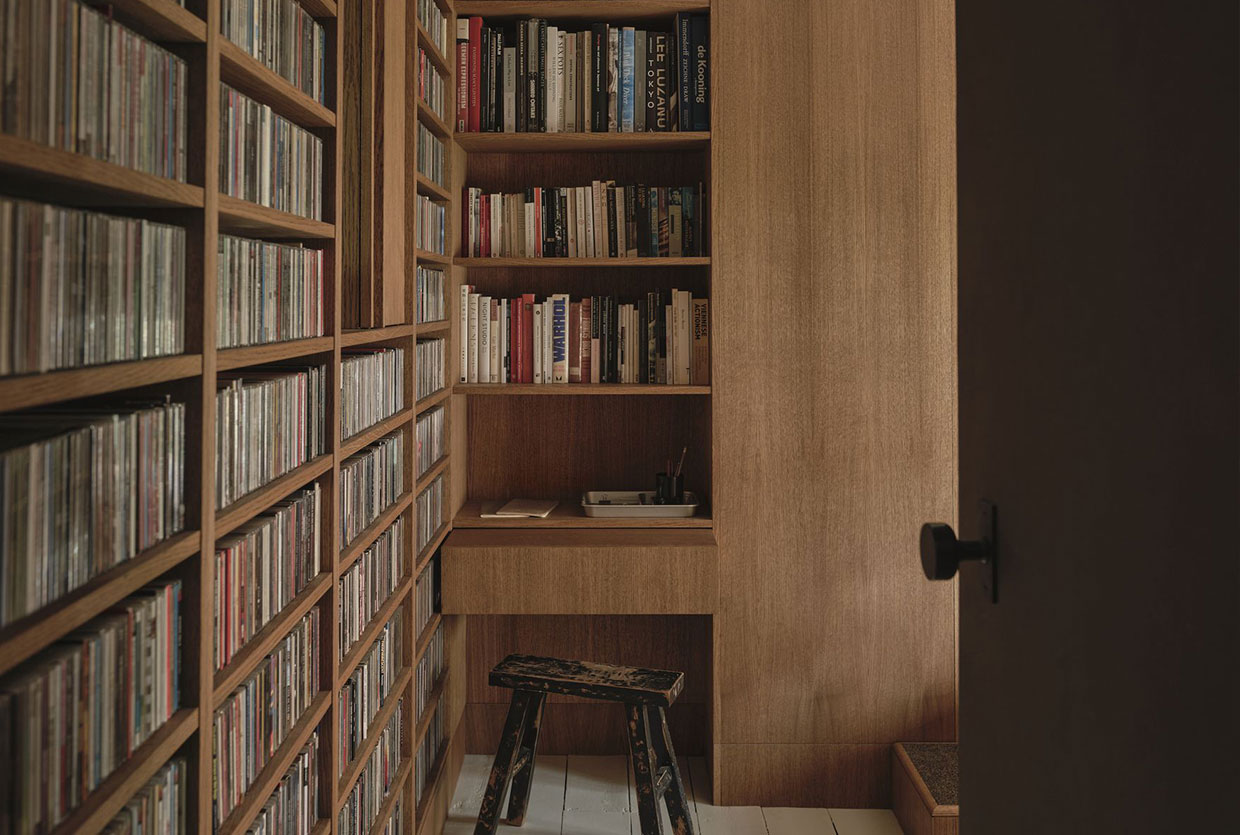
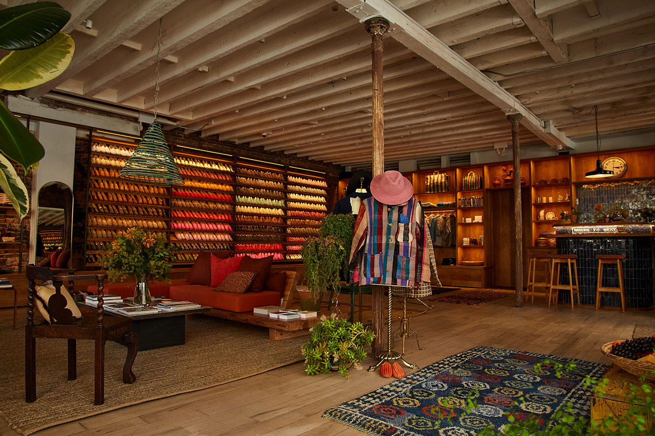
Beyond the Screen: Choosing Physical Wall Art for Your Office
While digital refreshes are instant and free, translating Sara Portieri’s aesthetic into your physical environment can create a truly cohesive sanctuary for work. When moving from the screen to the wall, I always recommend a "Zoning Strategy." This ensures that your bold art choices enhance, rather than overwhelm, your space.
1. The Reception & Creative Zone
In areas where you welcome clients or brainstorm (like a breakout table), go big. This is where Portieri’s surrealist characters thrive. A large-scale print here acts as a conversation starter and sets a tone of innovation.
2. The Focus Workstation
In your direct line of sight while working, choose pieces that are slightly more rhythmic and repetitive. A gallery wall of smaller surrealist prints can provide that 22% reduction in cognitive fatigue without the "jarring" effect of a single, massive focal point.
Pro Tips for Placement and Scaling
One of the most common mistakes I see in home offices is "art drift"—where a beautiful piece is hung at the wrong height or scale, making the whole room feel off-balance. To give your Sara Portieri-inspired space a professional polish, follow these two golden rules:
The Rule of Scale (The 2/3 Rule) Artwork should be roughly two-thirds the width of the desk, credenza, or sofa it hangs above. If your desk is 60 inches wide, your art (or your grouping of art) should span approximately 40 inches. This anchors the furniture and prevents the art from looking like it’s "floating" aimlessly on a giant wall.
The Importance of Professional Framing For high-contrast pop-art, the frame is the punctuation mark. I recommend a clean, matte black or white gallery frame to let the colors speak for themselves. Most importantly, use UV-protective glass. Vibrant reds and yellows—staples of the pop-art genre—are the most susceptible to fading in sunlit home offices. Protecting the investment ensures the "pop" lasts for years.
FAQ
Q: Will such a bold wallpaper be distracting during video calls? A: Actually, no. If you are sharing your screen, a clean, graphic wallpaper like Portieri’s looks much more professional and "curated" than a cluttered desktop full of files or a generic default mountain landscape.
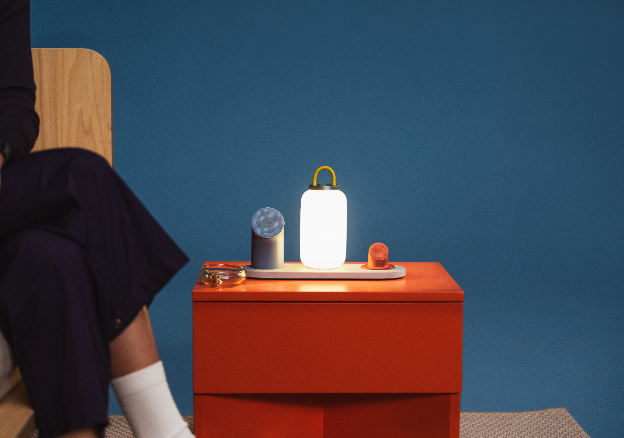
Q: How do I coordinate my physical desk accessories with this pop-art style? A: Look for "color blocking." Pair the wallpaper with solid-colored desk trays or a lamp in a primary color (red, blue, or yellow) found within the art. Avoid busy patterns in your physical accessories to let the digital art remain the star.
Q: Is surrealist art appropriate for a corporate office? A: Yes! Modern corporate design is leaning heavily into "resimercial" (residential + commercial) trends. Surrealist art signals that your company values creativity and "thinking outside the box," which is a powerful message for both employees and clients.
Refresh your view, reduce your fatigue, and let Sara Portieri’s "All Eyes on You" series remind you that even the most productive workday deserves a touch of the extraordinary. Happy June styling!