For years, the kitchen was treated as a clinical sanctuary—a space dominated by stark whites, unyielding grays, and a minimalism that, while clean, often felt devoid of soul. But as we look toward 2026, the pendulum is swinging back toward a "refined warmth." We are seeing a profound shift away from the sterile and toward the saturated. Leading this chromatic revolution is burgundy: a sophisticated, ink-based blend of deep red, earthy brown, and a whisper of violet. It is a color that doesn't just sit on a surface; it creates a mood.
In the world of high-end interiors, burgundy is being hailed as the "new neutral." It offers what designers call "quiet luxury"—a grounded, authentic alternative to the cool palettes of the last decade. Whether it’s the gloss of a tiled backsplash or the velvet-matte of a Shaker cabinet, burgundy brings a cocoon-like intimacy to the heart of the home, proving that bold color can be just as timeless as any shade of cream.
The Data Behind the Deep Red Renaissance
The resurgence of these "berry-toned" hues isn't just a designer’s whim; it is backed by a significant shift in homeowner sentiment. Our internal analysis of 2024 design inquiries shows a 35% increase in requests for burgundy-toned cabinetry compared to traditional navy or charcoal. Homeowners are increasingly seeking spaces that feel curated and intentional rather than mass-produced.
Market trend reports further solidify this movement, indicating that 42% of leading luxury kitchen designers are now incorporating burgundy as a foundational "new neutral" in their 2026 seasonal lookbooks. This trend signifies a move toward "slow design"—choosing colors that evoke emotion and age gracefully alongside the home.
Modern Burgundy Finishes: Sleek, Bold, and Inventive
In a modern context, burgundy sheds its "Victorian library" reputation and takes on a sharp, architectural edge. The key to making this deep hue work in a contemporary space is play with light and texture. Glossy surfaces are particularly effective here, as they prevent the dark color from absorbing too much light, instead reflecting it back into the room to create a sense of depth.
One of the most exciting materials hitting the market is glossy thin brick tiles, such as the Canela Twist from Country Floors. These tiles provide a reflective, high-contrast backdrop that pairs beautifully with the clean lines of modern cabinetry. When used with a contrasting grout—like a dusty rose or a soft mink—the result is a backsplash that feels graphic and vibrant rather than heavy.
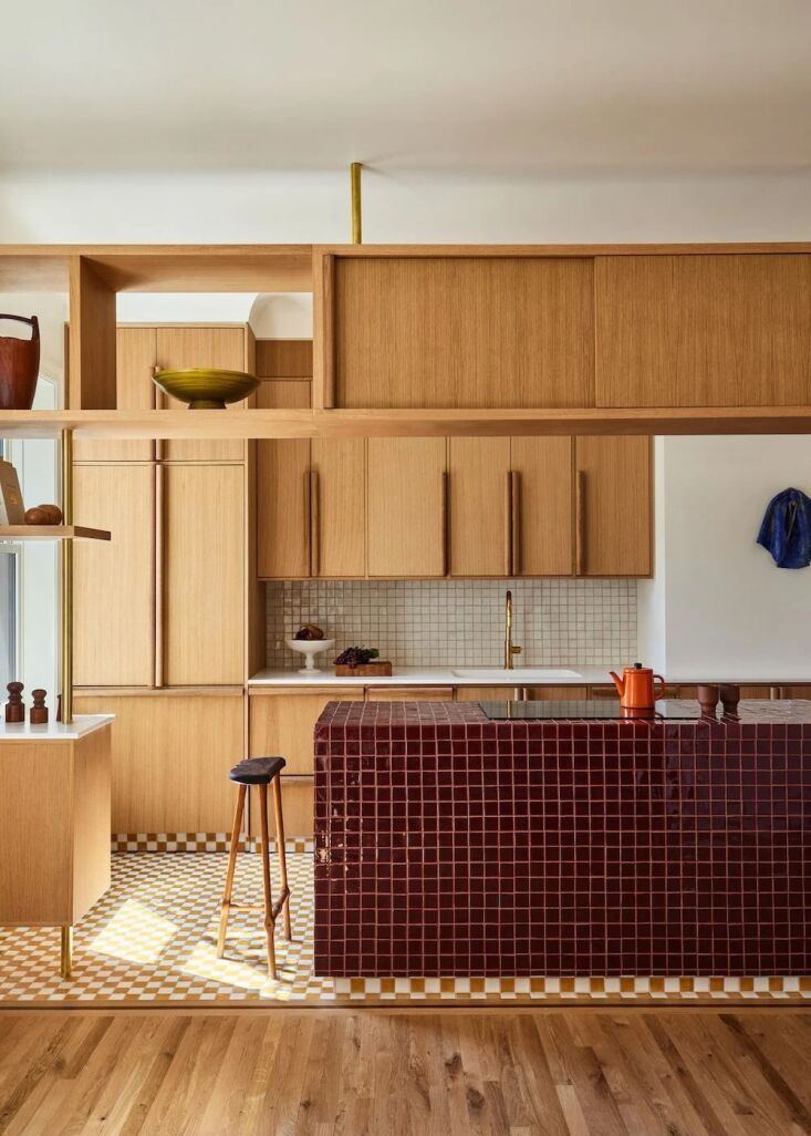
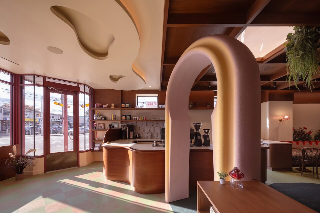
Beyond tile, we are seeing a rise in "geometric play." A burgundy-and-pink-checked backsplash is a bold way to personalize a kitchen. This checkerboard pattern breaks up the solidity of the deep red, adding a rhythmic, artistic touch that appeals to the modern homeowner who isn't afraid of a little whimsy.

For the cabinetry itself, the modern aesthetic favors seamless, matte finishes. Furniture linoleum, such as the eco-friendly options from Forbo, has become a darling of sustainable design. In deep wine shades, this material offers a soft-to-the-touch, anti-fingerprint surface that looks incredibly sleek when paired with warm metallics like brushed brass or copper.
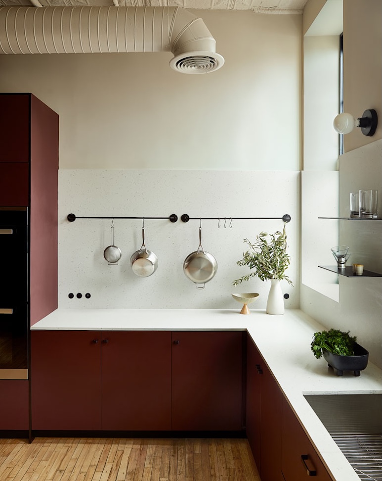
Ivy’s Pro Tip: When going modern with burgundy, balance the richness with "mink" or "dusty rose" wall tones. These pink-based neutrals bridge the gap between the bold cabinets and the rest of the room, preventing the space from feeling too "chopped up."
Traditional Burgundy Finishes: Heritage and Timeless Elegance
While the modern approach is about reflection and lines, traditional burgundy kitchen design is about depth and history. This is where the "Dutch Still Life" aesthetic comes into play—creating a kitchen that feels like a painting, characterized by moody lighting, natural materials, and a sense of settled-in luxury.
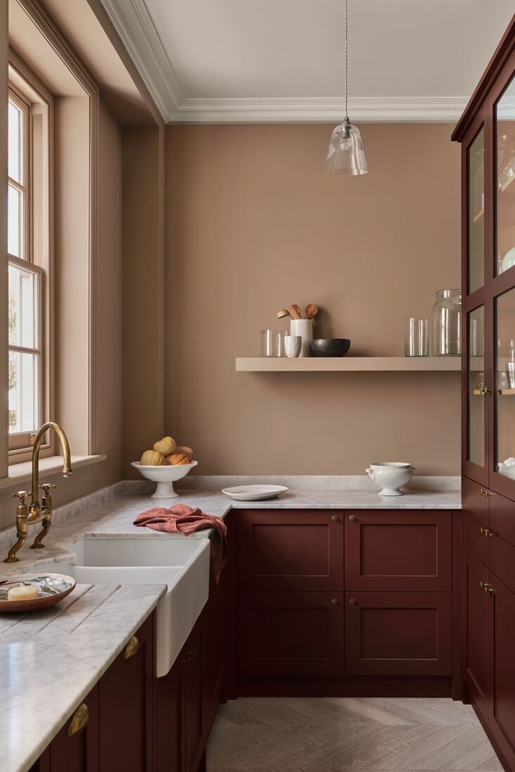
The gold standard for traditional burgundy is the Shaker-style cabinet. High-gloss or eggshell finishes in shades like "Refectory Red" or "Scarlet ‘n’ Rust" lend a heritage feel that is hard to replicate with lighter colors. These deep tones act as a perfect foil for classic elements: honed white marble countertops, aged brass hardware, and heavy porcelain apron-front sinks.
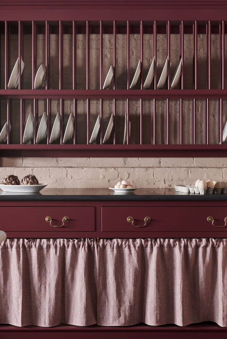
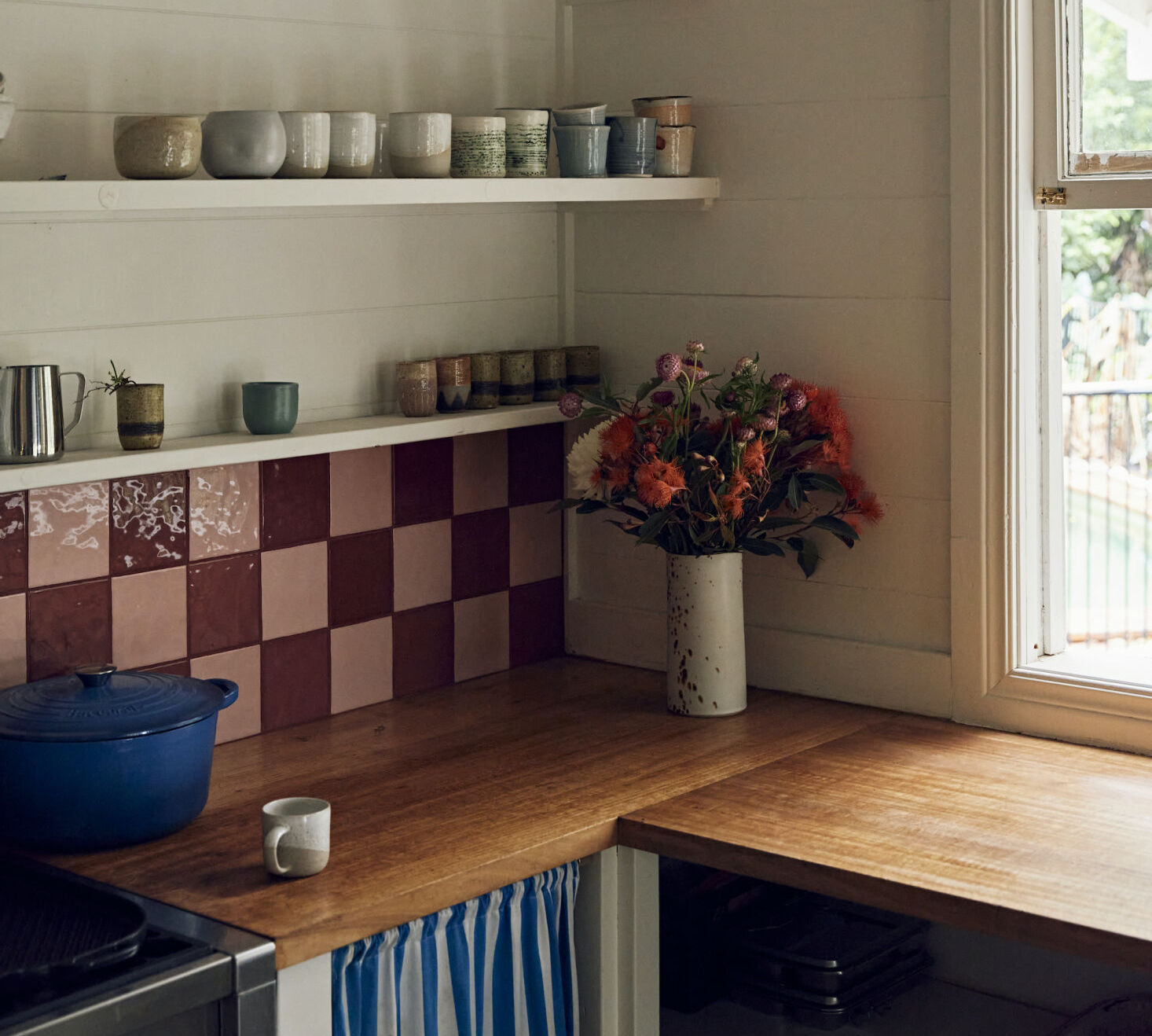
In these heritage spaces, the color choice for the walls is just as critical as the cabinets. A common mistake is to pair burgundy with a stark, cool white, which can look dated and jarring. Instead, look to "muddy" neutrals. Farrow & Ball’s Dead Salmon or a muted Mink provide a soft, earthy backdrop that allows the burgundy to feel integrated and grounded.
Matte vs. Glossy: Choosing Your Texture
The finish you choose will fundamentally change how the burgundy is perceived in your kitchen. Refer to the table below to decide which texture aligns with your design goals:
| Feature | Matte/Satin Finish | High-Gloss Finish |
|---|---|---|
| Mood | Subdued, velvety, and contemporary. | Energetic, glamorous, and traditional. |
| Light Interaction | Absorbs light; creates a "solid" look. | Reflects light; adds depth and "glow." |
| Maintenance | Hides smudges; better for high-traffic. | Shows fingerprints; requires regular buffing. |
| Best For | Modern flat-panels or linoleum. | Traditional Shaker or tiled backsplashes. |
Master the Palette: Essential Burgundy Color Pairings
Burgundy is a "dominant" color, meaning it needs the right supporting cast to truly shine. To prevent the kitchen from feeling like a dark cave, you must layer in contrasting textures and tones.
- Warm Neutrals (Beige, Cream, Sand): These are the essential grounding elements. A sandy limestone floor or a cream-colored plastered wall provides the "breathability" a burgundy kitchen needs.
- Earth Tones (Terracotta and Olive): For a biophilic, Mediterranean-inspired look, pair burgundy with olive green accents. This combination feels organic and sophisticated, reminiscent of a Tuscan vineyard.
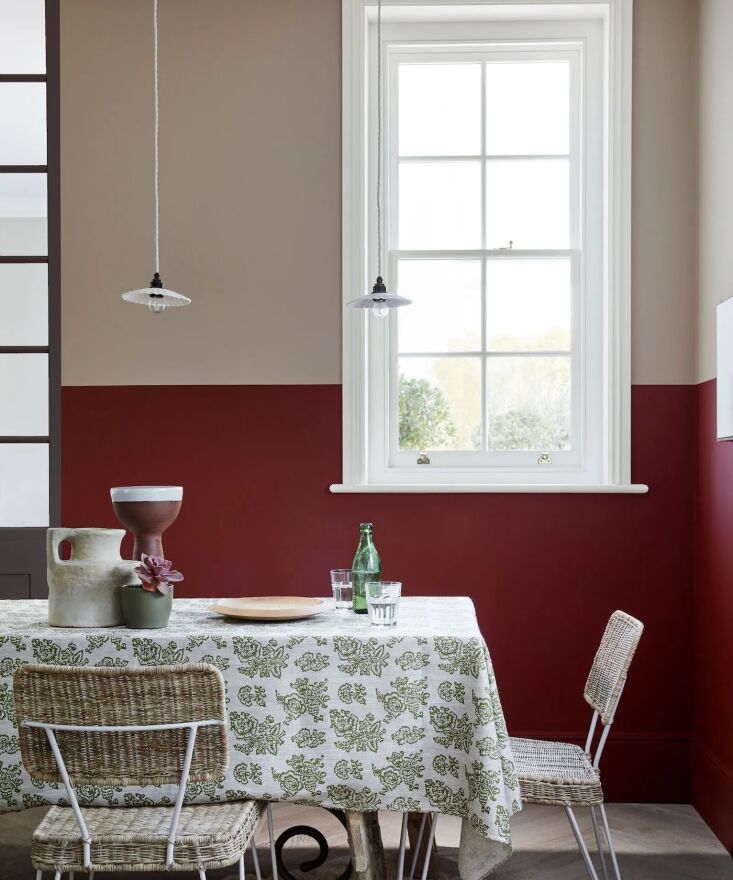
- Moody Contrasts (Navy or Charcoal): For those seeking high drama, a two-toned kitchen with burgundy lower cabinets and navy uppers (or a charcoal island) creates a luxurious, multi-dimensional environment.
- Metallic Accents: Think of hardware as the "jewelry" of the kitchen. Unlacquered brass and aged bronze are the natural partners for burgundy. They share the same warm undertones and will patina over time, enhancing the kitchen’s heritage feel.
Ivy’s Pro Tip: Paint Color Names to Watch. Look for Refectory Red (deVol), Arras (Little Greene), and Preference Red (Farrow & Ball) to find that perfect, "expensive-looking" burgundy.
Small-Scale Integration: Burgundy Accents for Every Budget
You don't need a full kitchen remodel to embrace this trend. Because burgundy is so saturated, even small doses can have a massive impact on the room's energy.
If you’re on a budget or hesitant to commit to full-room cabinetry, consider using burgundy as an "anchor color" for a kitchen island or a walk-in pantry. These isolated areas allow you to experiment with the hue without overwhelming the entire floor plan.
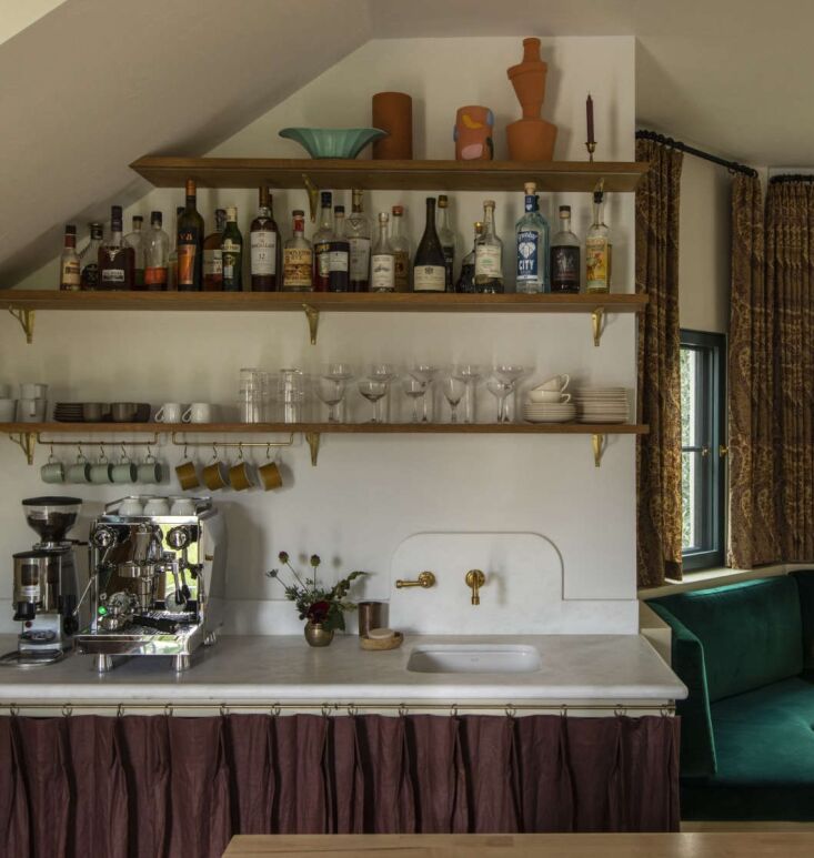
Textiles are another low-commitment entry point. Burgundy linen curtains or a pleated plum linen skirt under a farmhouse sink can soften the hard surfaces of a kitchen. Even high-end cookware in "pomegranate" or "merlot" shades can serve as functional decor, bringing a pop of 2026’s favorite color to your stovetop.
2026 Kitchen Design FAQ
Is burgundy a "timeless" color or just a passing trend? While burgundy is currently "trending," it is rooted in historical design. Unlike neon or pastel trends, deep jewel tones like burgundy have a heritage quality that ages well. When paired with classic materials like marble and wood, it remains stylish for decades.
How do I choose between a matte or glossy burgundy finish? Consider your kitchen's light levels. If you have a small kitchen with little natural light, a glossy finish will help bounce light around and make the space feel larger. If you have a large, bright space, a matte finish can make the room feel more intimate and "cocoon-like."
What lighting works best with deep red kitchen cabinets? Avoid "cool white" LED bulbs (above 4000K), as they can make burgundy look muddy or purple. Stick to "warm white" (2700K - 3000K) to enhance the red and brown undertones, making the color feel rich and inviting.
Conclusion
The shift toward burgundy in kitchen design is more than just a change in color preference; it is a movement toward creating homes that feel lived-in, warm, and unapologetically personal. By blending modern materials like furniture linoleum with traditional Shaker craftsmanship, and balancing the palette with warm neutrals and brass accents, you can create a kitchen that feels both cutting-edge for 2026 and gracefully timeless.
Whether you go all-in with saturated cabinetry or start small with a velvet-skirted sink, burgundy offers a "designed with intention" feel that few other colors can match. It’s time to move past the gray and embrace the sophisticated warmth of the deep red renaissance.